lets Connect


Download Resume


I’m Dhiraj Chouhan


This case study is best viewed on a larger screen.
Please continue on a laptop or desktop to explore the complete design narrative.
I live for flow-that sweet spot where creativity meets clarity.
View Resume


@imdhirajchouhan
Back to Top

I’m Dhiraj Chouhan
Download Resume


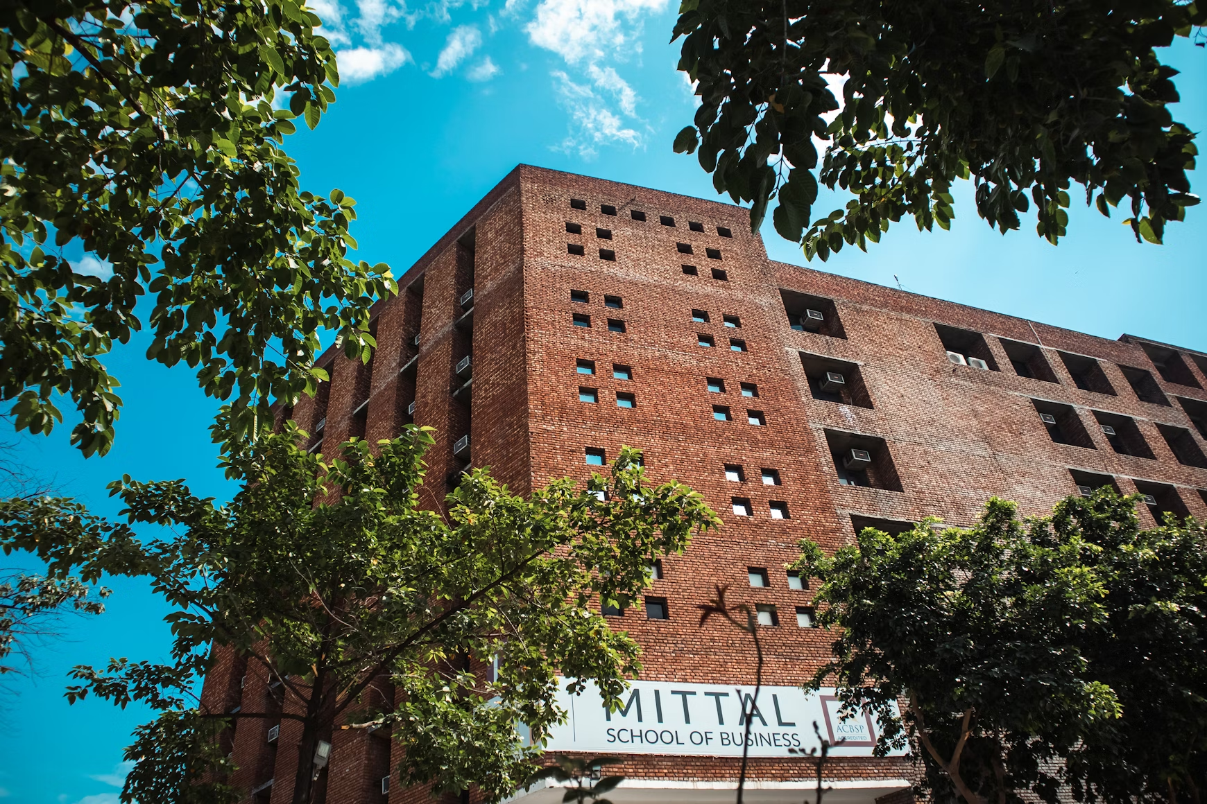
Masters’ Union
Designing for Scale
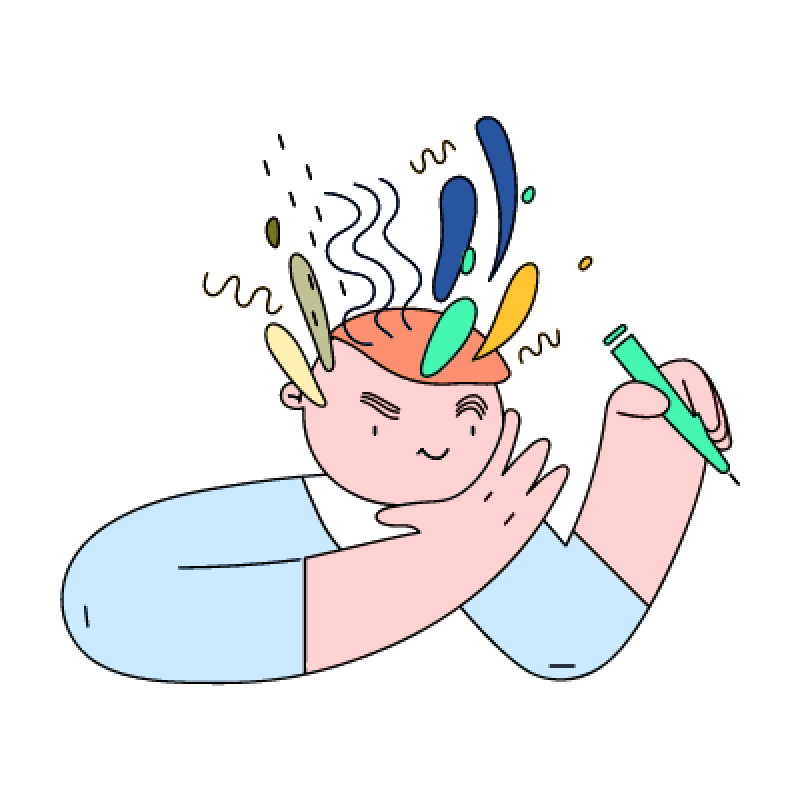
Overview ✨
I joined Masters’ Union in 2020 as a fresher to design their digital experience. Over four years, I helped scale the platform from a 20-page site to a robust ecosystem supporting 10+ programs, 150+ pages and 70+ events, while driving over 70 marketing campaigns.
Eventually, I led an 8-person design team and created a scalable, systematic Design System that streamlined workflows and reinforced the brand’s premium positioning.
View Website

My Contribution
Roadmap Definition
Atomic-level components
UI/UX Design & Prototyping
Scalable, Reusable system
Technical Implementation
The Team
1 × Researcher
8 × Designers
1 × Product Manager
10+ × Marketer
6+ × Engineers
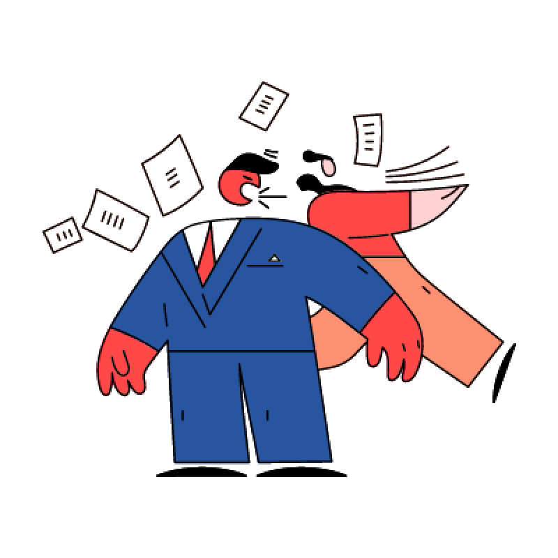
The Challenge 🔎
Rapid growth exposed three core problems:
- Scalability & Efficiency: The site couldn’t handle the growing volume, creating bottlenecks in design and engineering.
- Engagement & Brand Alignment: The design failed to reflect the premium brand positioning, resulting in poor user engagement.
- Process & Stakeholder Chaos: Complex approval workflows and file management issues caused friction with C-level stakeholders.
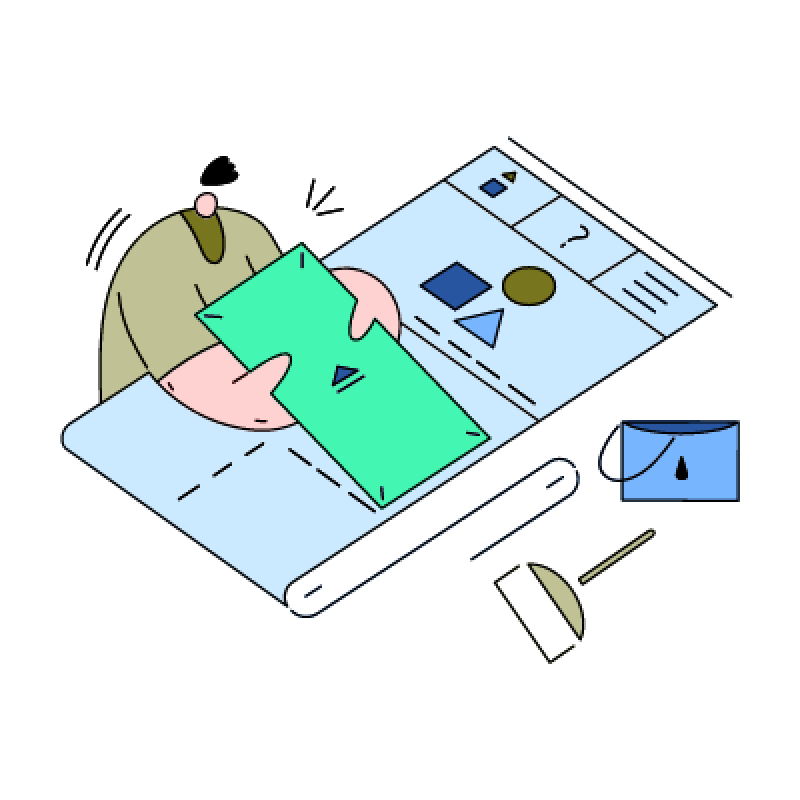
Process 📝
- Discovery & Research 🧠
- Conducted interviews with founders, managers and internal teams to understand goals.
- Collected feedback from Marketing and stakeholders.
- Analyzed user behavior data and performed competitive benchmarking.
Outcome: Clear understanding of key pain points and opportunities for growth.
2. Information Architecture & Strategy 🏗️
- Redesigned the sitemap to organize 100+ programs efficiently.
- Created intuitive user flows for seamless content navigation.
- Prioritized mobile-first navigation for core users.
Impact: Simplified discovery of programs and content, reducing user friction.
3. UX/UI Design 🎨
- Designed a premium visual language with clear typography and interactive prototypes.
- Enabled self-service content updates in figma for internal teams.
Impact: Improved brand perception and empowered teams to maintain content quickly.
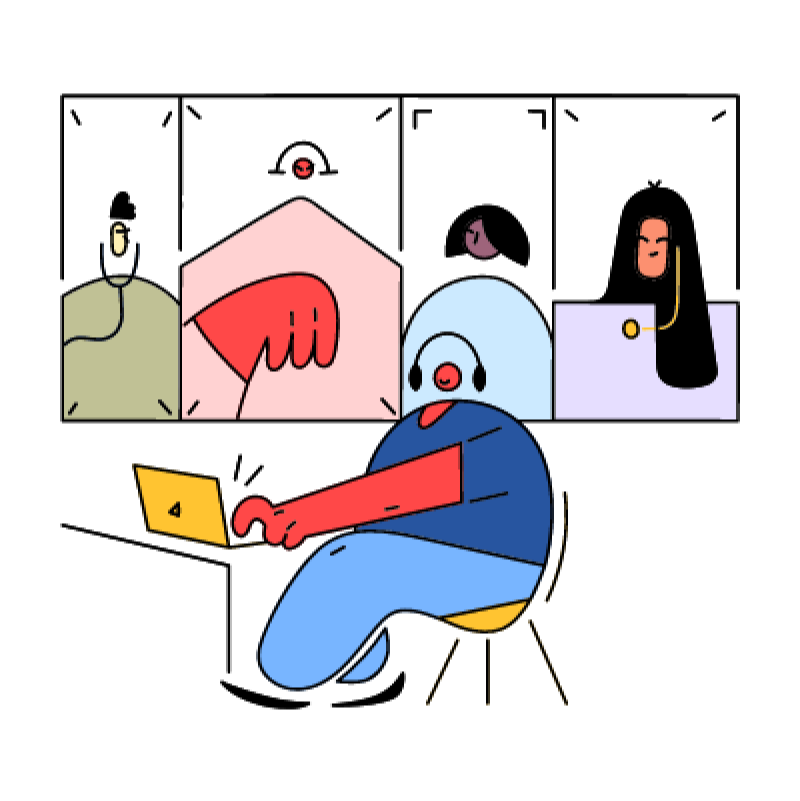
4. Collaboration & Execution 🚑
- Coordinated design strategy with founders, marketing and engineering.
- Streamlined daily workflows using Notion and Agile sprints.
- Partnered with engineering for QA and smooth delivery.
Impact: Reduced bottlenecks and improved project execution.
5. Iteration & Evolution 🔄
- Used user feedback and engagement metrics to identify areas for improvement.
- Validated features with A/B testing.
- Documented insights for future scalability.
Outcome: Continuous enhancement of user experience and platform efficiency.


Observation
Introduce a consistent design system aligned with the new brand identity to create visual coherence and scalability across pages.
Observation:
The highlights section is simple and provides blunt, minimal information. The journey and USP are not clearly communicated.
Possible Improvement:
Enhance storytelling with more engaging content, key USPs and richer information that guides users through the value of the program. Consider visual storytelling elements like icons, visuals, or short snippets.
Observation:
Navigation lacks clarity. Users cannot easily access different programs and there’s no prioritisation for special programs. The all-in-one navigation creates confusion.
Possible Improvement:
Implement a clear, hierarchical navigation with global search functionality to access different program pages. Highlight special programs with visual emphasis or prioritization cues.
Observation:
The social handles are scattered in different thumbnails.
Observation:
Learn by Doing section is just three static tabs with minimal storytelling. No context, no engaging journey, no videos to showcase real-world outcomes.
Possible Improvement:
Reformat into three distinct sections that highlight the program’s USP, add video snippets or student stories and create a narrative that showcases how learning is applied in real-world projects.
Observation:
The current FAQ has limited discoverability and less FAQ no search or categorisation.
Possible Improvement:
A searchable, expandable FAQ system grouped by topics (Program, Admissions, Placements, etc.).
Observation:
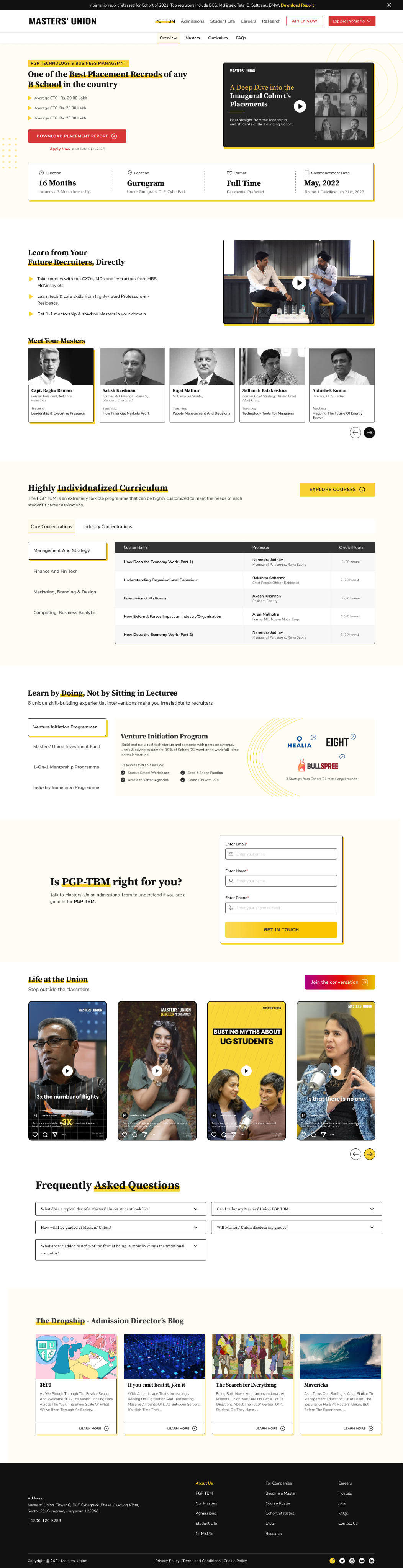
Current hero section has heading, tagline and a button for “Download Placement Report,” while “Apply Now” appears as simple text. Users are not guided effectively toward primary actions.
Possible Improvement:
Make “Apply Now” the primary button to emphasise immediate action. Keep “Download Placement Report” as secondary. Strengthen copy, video in BG and visual hierarchy to highlight the primary goal of the section.
Observation:
Curriculum is presented in tabs, but lacks structure - no breakdown of terms or in-class vs out-of-class components. Only professor names and course titles are visible.
Possible Improvement:
Create a structured layout showing Term 1, Term 2, Term 3 and differentiate in-class vs out-of-class experiences. Add context such as course objectives, visual anchors, or success stories to make it more engaging.
Observation:
The form is too simple and uninspiring; many users drop off before submission.
Possible Improvement:
Users are unable to understand the purpose of the form or why they should fill it out. Even though we are providing section titles, there is no hook or context to guide them. Every section needs a clear CTA to tell users what to do next.
Design System Overview
(Atomic Level Explanation)
Atoms (Basic Elements)
1 Color → All foundational color tokens
2 Typography → Font families, scales, weights
3 Shadows & Blurs → Depth system
4 Spacing → Spacing tokens
5 Icon → Iconography library
Molecules
06 Button
07 Text Fields
08 Dropdown
09 Checkbox / Radio
10 Persona Facepile
11 Badges
12 Date Picker
Organisms
13 Teaching Bubble
14 Slider Rating
15 Progress Bar
16 Breadcrumbs
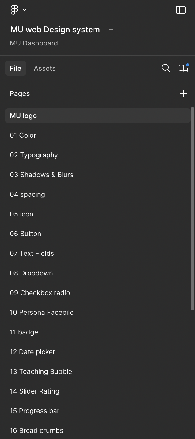


Design Tokens:
Colors, Typography, Shadows
Components Library:
Atoms → Molecules → Organisms
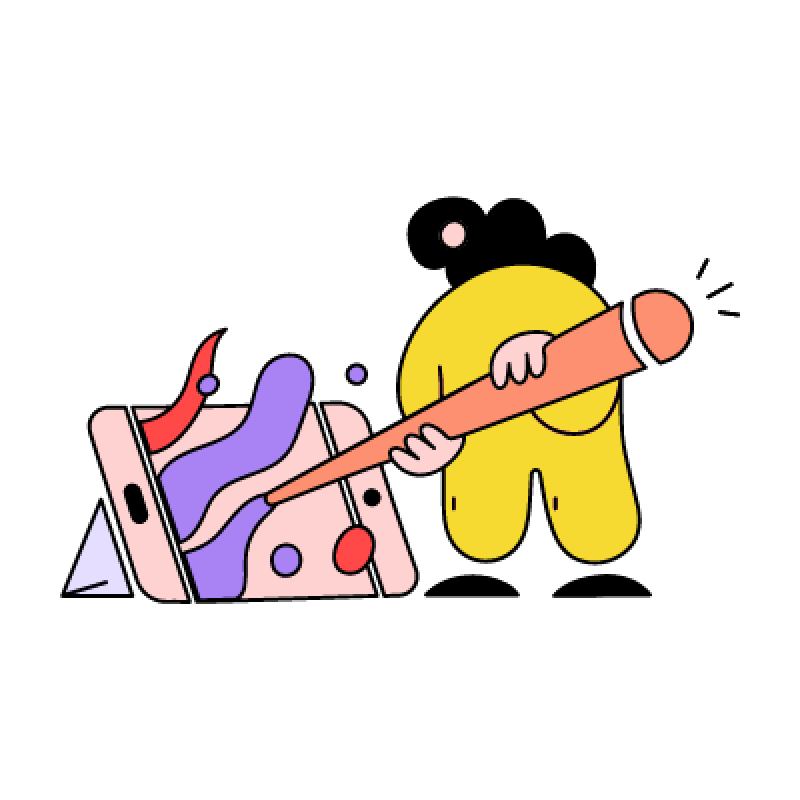
Welcome to Phase 1: Ideation & Design
Welcome to Phase 1 of the design process! This is where ideas take shape, inspirations are gathered and initial concepts are brought to life. As a designer, you are in the early stages of creating a vision for the website.
Your role in this phase is to brainstorm 🤔, experiment 🧪 and craft multiple iterations 🧵before moving forward for approval ✅.
Scenario: The Story Behind Phase 1 🏗️
Step 1:
Pratham shares the design brief, explaining what’s needed.
Step 2:
Harsh, the designer, gathers the team or consults with the design head. They brainstorm ideas and discuss possible directions.
Step 3:
Harsh starts collecting inspirations, analyzing competitor designs and sketching out ideas.
Step 4:
Multiple design iterations are created-both for web and mobile views.
Step 5:
Once a solid concept is ready, Harsh finalizes the Phase 1 design and moves it to Phase 2 for approval.
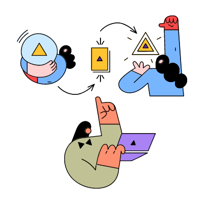
Welcome to Phase 2:
POC Approval & Iterations
Congratulations! ✨ You’ve completed the ideation and design phase and now it’s time for review and approval. This phase ensures that the design is aligned with the project’s vision before moving forward.
In Phase 2, your design is evaluated by the POC and feedback is given. This is a crucial step to refine the design and ensure it meets expectations.
Notes: If changes are required, You will go back to the Phase 1 file, complete the necessary edits and then resubmit the updated design in Phase 2 for re-approval.
Scenario: The Story Behind Phase 2 🏢
Step 1:
Harsh shares the design with Pratham in the Phase 2 file.
Step 2:
Pratham carefully reviews it, ensuring it aligns with the project’s needs.
Step 3:
There are two possible outcomes:
✅ Approved!
🔄 Revisions Needed!
Step 4:
If changes were made, Harsh goes back to the Phase 1 file, completes the necessary edits and then resubmits the updated design in Phase 2 for re-approval.
Step 5:
Once Pratham is satisfied, the design is officially approved and moves forward.
Welcome to Phase 3: Final Content Updates & Developer Handoff
You’ve made it to Phase 3, the final step before development! By now, the design has gone through ideation, iterations and approval.
This phase ensures that all content-text, images and assets-are finalized and ready for developers to bring the design to life.
This is where attention to accuracy and detail is crucial, as any inconsistencies can affect the final product.
Scenario: The Story Behind Phase 3
Step 1:
Harsh (the designer) reviews the approved design and ensures that all text, images and assets are finalized.
Step 2:
He checks if any placeholder content needs to be replaced with the final version.
Step 3:
He ensures that mobile and web versions have the correct typography, spacing and image resolutions.
Step 4:
The design is packaged and prepared with organized layers, developer annotations and export-ready assets.
Step 5:
The final file is shared with the development team for implementation.
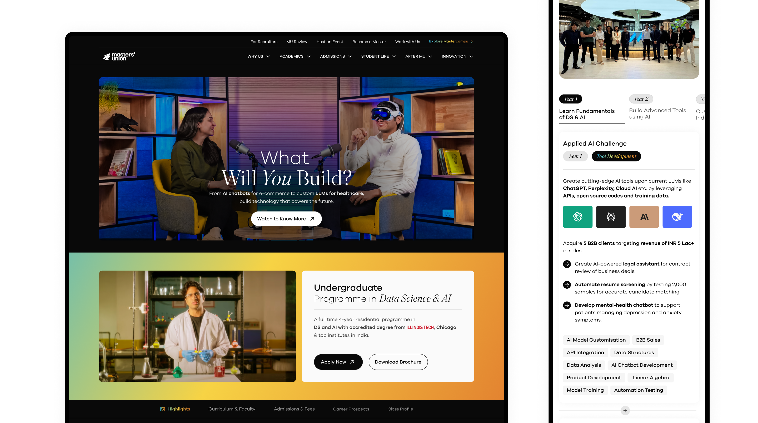
Refreshed visuals, clear storytelling and seamless user experience Ready to shine! ✨

Simplified
Navigation for Faster Discovery
We restructured the entire information architecture by grouping pages based on user intent rather than internal hierarchies. This makes it easier for users to find programs, understand offerings and move across sections without confusion.

Why this improves UX
- Reduces cognitive load and eliminates hierarchy fatigue
- Makes all programs discoverable in 1–2 clicks
- Supports role-based journeys like Students, Parents, Faculty, Partners
UX psychology + decision design


Learn by Doing (hook)
- Primacy Effect: Lead with core USP to anchor perception early.
- Cognitive Fluency: Simple phrase → faster recall + lower mental load.
Business Education (CTA)
- Emotional First → Rational Later: Video CTA builds intent before applications.
- Progressive Disclosure: Yearbook download targets high-intent users.
FOMO-Driven Admissions Designed for Action
- Countdown + deadlines create urgency bias, nudging users to apply now instead of delaying.
- Tab layout groups programs, news, events without overwhelming-using progressive disclosure.
Showcase Real Work, Not Claims (Validated by User Behavior)
- Breaking into 3 tangible journeys (Dropshipping → VIP → Demo Day) reduces ambiguity using chunking.
- Proof metrics + videos build behavioral trust faster than abstract promises, driving deeper engagement.
Scrolling Timeline With Auto-Synced Visual Proof
Timeline structure reduces overwhelm using linear progression, not a grid of information.
Clear Faculty Breakdown for Instant Understanding
- Split into 3 segments for structured clarity instead of a mixed roster.
- Percentage distribution creates a quick mental model of who teaches.
- Faces + titles help users map expertise to real people instantly.
Testimonials Designed as Conversational Videos
- Large center frame draws focus using visual hierarchy, while side cards create peripheral context.
- Horizontal scroll mimics story consumption behavior, inviting continued swiping.
Real Businesses. Real Leaders. Real Outcomes.
- Authority Bias: Practitioners as faculty = higher trust conversion.
- Contextual Imagery (Cyberpark): Communicates credibility without text.
Real No. That Build Instant Trust
- Faces + names trigger social proof bias, making outcomes feel real not claimed.
- Numbers anchor emotions with verifiable credibility, reducing doubt.
- Relatable profiles spark “this could be me” identification, increasing intent to explore.
Seamless Program Discovery With Minimal Effort
- Category tabs reduce cognitive load using Hick’s Law-fewer decisions to reach the right program.
- Rich cards surface key info (format, eligibility, deadline) upfront, enabling fast scanning & comparison.
- Only 1–2 clicks to reach full details, improving conversion from browsing → exploring → applying.
Real Startups, Real People, Real Reels
- Vertical, edge-to-edge videos mimic Instagram/TikTok muscle memory, boosting time-on-page.
- Auto-swipe carousel reduces friction using habitual interaction patterns users already understand.
Instant Clarity Through a Short Product Walkthrough
- 15s video reduces cognitive effort by showing the platform instead of making users infer from UI.
- Motion + real interface creates context before reading, improving comprehension speed.
A/B tests showed users ignored generic copy → restructuring into 3 journeys improves clarity via chunking.
Sticky media swaps based on scroll, creating context-per-action without extra interaction.
I live for flow-that sweet spot where creativity meets clarity.
View Resume
@imdhirajchouhan
Back to Top
I’m Dhiraj Chouhan
Download Resume
Masters’ Union
Designing for Scale
Overview ✨
I joined Masters’ Union in 2020 as a fresher to design their digital experience. Over four years, I helped scale the platform from a 20-page site to a robust ecosystem supporting 10+ programs, 150+ pages and 70+ events, while driving over 70 marketing campaigns.
Eventually, I led an 8-person design team and created a scalable, systematic Design System that streamlined workflows and reinforced the brand’s premium positioning.
View Website
My Contribution
Roadmap Definition
Atomic-level components
UI/UX Design & Prototyping
Scalable, Reusable system
Technical Implementation
The Team
1 × Researcher
8 × Designers
1 × Product Manager
10+ × Marketer
6+ × Engineers
The Challenge 🔎
Rapid growth exposed three core problems:
- Scalability & Efficiency: The site couldn’t handle the growing volume, creating bottlenecks in design and engineering.
- Engagement & Brand Alignment: The design failed to reflect the premium brand positioning, resulting in poor user engagement.
- Process & Stakeholder Chaos: Complex approval workflows and file management issues caused friction with C-level stakeholders.
Process 📝
- Discovery & Research 🧠
- Conducted interviews with founders, managers and internal teams to understand goals.
- Collected feedback from Marketing and stakeholders.
- Analyzed user behavior data and performed competitive benchmarking.
Outcome: Clear understanding of key pain points and opportunities for growth.
2. Information Architecture & Strategy 🏗️
- Redesigned the sitemap to organize 100+ programs efficiently.
- Created intuitive user flows for seamless content navigation.
- Prioritized mobile-first navigation for core users.
Impact: Simplified discovery of programs and content, reducing user friction.
3. UX/UI Design 🎨
- Designed a premium visual language with clear typography and interactive prototypes.
- Enabled self-service content updates in figma for internal teams.
Impact: Improved brand perception and empowered teams to maintain content quickly.
4. Collaboration & Execution 🚑
- Coordinated design strategy with founders, marketing and engineering.
- Streamlined daily workflows using Notion and Agile sprints.
- Partnered with engineering for QA and smooth delivery.
Impact: Reduced bottlenecks and improved project execution.
5. Iteration & Evolution 🔄
- Used user feedback and engagement metrics to identify areas for improvement.
- Validated features with A/B testing.
- Documented insights for future scalability.
Outcome: Continuous enhancement of user experience and platform efficiency.


Observation
Introduce a consistent design system aligned with the new brand identity to create visual coherence and scalability across pages.
Observation:
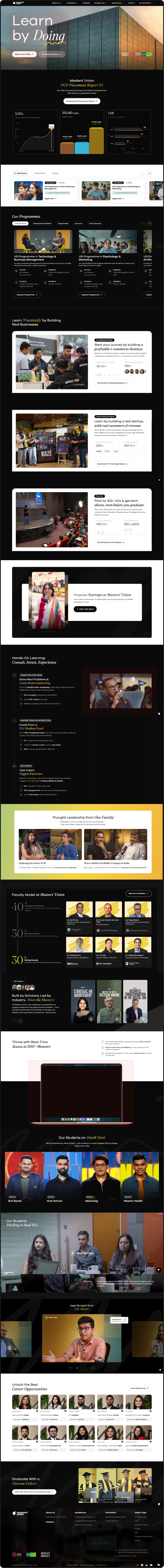
The highlights section is simple and provides blunt, minimal information. The journey and USP are not clearly communicated.
Possible Improvement:
Enhance storytelling with more engaging content, key USPs and richer information that guides users through the value of the program. Consider visual storytelling elements like icons, visuals, or short snippets.
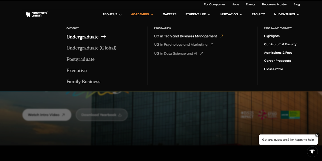
Observation:
Navigation lacks clarity. Users cannot easily access different programs and there’s no prioritisation for special programs. The all-in-one navigation creates confusion.
Possible Improvement:
Implement a clear, hierarchical navigation with global search functionality to access different program pages. Highlight special programs with visual emphasis or prioritization cues.
Observation:
The social handles are scattered in different thumbnails.
Observation:
Learn by Doing section is just three static tabs with minimal storytelling. No context, no engaging journey, no videos to showcase real-world outcomes.
Possible Improvement:
Reformat into three distinct sections that highlight the program’s USP, add video snippets or student stories and create a narrative that showcases how learning is applied in real-world projects.
Observation:
The current FAQ has limited discoverability and less FAQ no search or categorisation.
Possible Improvement:
A searchable, expandable FAQ system grouped by topics (Program, Admissions, Placements, etc.).
Observation:
Current hero section has heading, tagline and a button for “Download Placement Report,” while “Apply Now” appears as simple text. Users are not guided effectively toward primary actions.
Possible Improvement:
Make “Apply Now” the primary button to emphasise immediate action. Keep “Download Placement Report” as secondary. Strengthen copy, video in BG and visual hierarchy to highlight the primary goal of the section.
Observation:
Curriculum is presented in tabs, but lacks structure - no breakdown of terms or in-class vs out-of-class components. Only professor names and course titles are visible.
Possible Improvement:
Create a structured layout showing Term 1, Term 2, Term 3 and differentiate in-class vs out-of-class experiences. Add context such as course objectives, visual anchors, or success stories to make it more engaging.
Observation:
The form is too simple and uninspiring; many users drop off before submission.
Possible Improvement:
Users are unable to understand the purpose of the form or why they should fill it out. Even though we are providing section titles, there is no hook or context to guide them. Every section needs a clear CTA to tell users what to do next.
Design System Overview (Atomic Level Explanation)
Atoms (Basic Elements)
1 Color → All foundational color tokens
2 Typography → Font families, scales, weights
3 Shadows & Blurs → Depth system
4 Spacing → Spacing tokens
5 Icon → Iconography library
Molecules
06 Button
07 Text Fields
08 Dropdown
09 Checkbox / Radio
10 Persona Facepile
11 Badges
12 Date Picker
Organisms
13 Teaching Bubble
14 Slider Rating
15 Progress Bar
16 Breadcrumbs


Design Tokens:
Colors, Typography, Shadows
Components Library:
Atoms → Molecules → Organisms
Welcome to Phase 1: Ideation & Design
Welcome to Phase 1 of the design process! This is where ideas take shape, inspirations are gathered and initial concepts are brought to life. As a designer, you are in the early stages of creating a vision for the website.
Your role in this phase is to brainstorm 🤔, experiment 🧪 and craft multiple iterations 🧵before moving forward for approval ✅.
Scenario: The Story Behind Phase 1 🏗️
Step 1:
Pratham shares the design brief, explaining what’s needed.
Step 2:
Harsh, the designer, gathers the team or consults with the design head. They brainstorm ideas and discuss possible directions.
Step 3:
Harsh starts collecting inspirations, analyzing competitor designs and sketching out ideas.
Step 4:
Multiple design iterations are created-both for web and mobile views.
Step 5:
Once a solid concept is ready, Harsh finalizes the Phase 1 design and moves it to Phase 2 for approval.
Welcome to Phase 2: POC Approval & Iterations
Congratulations! ✨ You’ve completed the ideation and design phase and now it’s time for review and approval. This phase ensures that the design is aligned with the project’s vision before moving forward.
In Phase 2, your design is evaluated by the POC and feedback is given. This is a crucial step to refine the design and ensure it meets expectations.
Notes: If changes are required, You will go back to the Phase 1 file, complete the necessary edits and then resubmit the updated design in Phase 2 for re-approval.
Scenario: The Story Behind Phase 2 🏢
Step 1:
Harsh shares the design with Pratham in the Phase 2 file.
Step 2:
Pratham carefully reviews it, ensuring it aligns with the project’s needs.
Step 3:
There are two possible outcomes:
✅ Approved!
🔄 Revisions Needed!
Step 4:
If changes were made, Harsh goes back to the Phase 1 file, completes the necessary edits and then resubmits the updated design in Phase 2 for re-approval.
Step 5:
Once Pratham is satisfied, the design is officially approved and moves forward.
Welcome to Phase 3: Final Content Updates & Developer Handoff
You’ve made it to Phase 3, the final step before development! By now, the design has gone through ideation, iterations and approval.
This phase ensures that all content-text, images and assets-are finalized and ready for developers to bring the design to life.
This is where attention to accuracy and detail is crucial, as any inconsistencies can affect the final product.
Scenario: The Story Behind Phase 3
Step 1:
Harsh (the designer) reviews the approved design and ensures that all text, images and assets are finalized.
Step 2:
He checks if any placeholder content needs to be replaced with the final version.
Step 3:
He ensures that mobile and web versions have the correct typography, spacing and image resolutions.
Step 4:
The design is packaged and prepared with organized layers, developer annotations and export-ready assets.
Step 5:
The final file is shared with the development team for implementation.
Refreshed visuals, clear storytelling and seamless user experience Ready to shine! ✨
Simplified
Navigation for Faster Discovery
We restructured the entire information architecture by grouping pages based on user intent rather than internal hierarchies. This makes it easier for users to find programs, understand offerings and move across sections without confusion.

Why this improves UX
- Reduces cognitive load and eliminates hierarchy fatigue
- Makes all programs discoverable in 1–2 clicks
- Supports role-based journeys like Students, Parents, Faculty, Partners
UX psychology + decision design


Learn by Doing (hook)
- Primacy Effect: Lead with core USP to anchor perception early.
- Cognitive Fluency: Simple phrase → faster recall + lower mental load.
Business Education (CTA)
- Emotional First → Rational Later: Video CTA builds intent before applications.
- Progressive Disclosure: Yearbook download targets high-intent users.
FOMO-Driven Admissions Designed for Action
- Countdown + deadlines create urgency bias, nudging users to apply now instead of delaying.
- Tab layout groups programs, news, events without overwhelming-using progressive disclosure.
Showcase Real Work, Not Claims (Validated by User Behavior)
- Breaking into 3 tangible journeys (Dropshipping → VIP → Demo Day) reduces ambiguity using chunking.
- Proof metrics + videos build behavioral trust faster than abstract promises, driving deeper engagement.
Scrolling Timeline With Auto-Synced Visual Proof
Timeline structure reduces overwhelm using linear progression, not a grid of information.
Clear Faculty Breakdown for Instant Understanding
- Split into 3 segments for structured clarity instead of a mixed roster.
- Percentage distribution creates a quick mental model of who teaches.
- Faces + titles help users map expertise to real people instantly.
Testimonials Designed as Conversational Videos
- Large center frame draws focus using visual hierarchy, while side cards create peripheral context.
- Horizontal scroll mimics story consumption behavior, inviting continued swiping.
Real Businesses. Real Leaders. Real Outcomes.
- Authority Bias: Practitioners as faculty = higher trust conversion.
- Contextual Imagery (Cyberpark): Communicates credibility without text.
Real No. That Build Instant Trust
- Faces + names trigger social proof bias, making outcomes feel real not claimed.
- Numbers anchor emotions with verifiable credibility, reducing doubt.
- Relatable profiles spark “this could be me” identification, increasing intent to explore.
Seamless Program Discovery With Minimal Effort
- Category tabs reduce cognitive load using Hick’s Law-fewer decisions to reach the right program.
- Rich cards surface key info (format, eligibility, deadline) upfront, enabling fast scanning & comparison.
- Only 1–2 clicks to reach full details, improving conversion from browsing → exploring → applying.
Real Startups, Real People, Real Reels
- Vertical, edge-to-edge videos mimic Instagram/TikTok muscle memory, boosting time-on-page.
- Auto-swipe carousel reduces friction using habitual interaction patterns users already understand.
Instant Clarity Through a Short Product Walkthrough
- 15s video reduces cognitive effort by showing the platform instead of making users infer from UI.
- Motion + real interface creates context before reading, improving comprehension speed.
A/B tests showed users ignored generic copy → restructuring into 3 journeys improves clarity via chunking.
Sticky media swaps based on scroll, creating context-per-action without extra interaction.
I live for flow-that sweet spot where creativity meets clarity.
View Resume
@imdhirajchouhan
Back to Top
I’m Dhiraj Chouhan
Download Resume
Masters’ Union
Designing for Scale
Overview ✨
I joined Masters’ Union in 2020 as a fresher to design their digital experience. Over four years, I helped scale the platform from a 20-page site to a robust ecosystem supporting 10+ programs, 150+ pages and 70+ events, while driving over 70 marketing campaigns.
Eventually, I led an 8-person design team and created a scalable, systematic Design System that streamlined workflows and reinforced the brand’s premium positioning.

My Contribution
Roadmap Definition
Atomic-level components
UI/UX Design & Prototyping
Scalable, Reusable system
Technical Implementation
The Team
1 × Researcher
8 × Designers
1 × Product Manager
10+ × Marketer
6+ × Engineers
The Challenge 🔎
Rapid growth exposed three core problems:
- Scalability & Efficiency: The site couldn’t handle the growing volume, creating bottlenecks in design and engineering.
- Engagement & Brand Alignment: The design failed to reflect the premium brand positioning, resulting in poor user engagement.
- Process & Stakeholder Chaos: Complex approval workflows and file management issues caused friction with C-level stakeholders.
Process 📝
- Discovery & Research 🧠
- Conducted interviews with founders, managers and internal teams to understand goals.
- Collected feedback from Marketing and stakeholders.
- Analyzed user behavior data and performed competitive benchmarking.
Outcome: Clear understanding of key pain points and opportunities for growth.
2. Information Architecture & Strategy 🏗️
- Redesigned the sitemap to organize 100+ programs efficiently.
- Created intuitive user flows for seamless content navigation.
- Prioritized mobile-first navigation for core users.
Impact: Simplified discovery of programs and content, reducing user friction.
3. UX/UI Design 🎨
- Designed a premium visual language with clear typography and interactive prototypes.
- Enabled self-service content updates in figma for internal teams.
Impact: Improved brand perception and empowered teams to maintain content quickly.
4. Collaboration & Execution 🚑
- Coordinated design strategy with founders, marketing and engineering.
- Streamlined daily workflows using Notion and Agile sprints.
- Partnered with engineering for QA and smooth delivery.
Impact: Reduced bottlenecks and improved project execution.
5. Iteration & Evolution 🔄
- Used user feedback and engagement metrics to identify areas for improvement.
- Validated features with A/B testing.
- Documented insights for future scalability.
Outcome: Continuous enhancement of user experience and platform efficiency.
Observation
Introduce a consistent design system aligned with the new brand identity to create visual coherence and scalability across pages.
Observation:
The highlights section is simple and provides blunt, minimal information. The journey and USP are not clearly communicated.
Possible Improvement:
Enhance storytelling with more engaging content, key USPs and richer information that guides users through the value of the program. Consider visual storytelling elements like icons, visuals, or short snippets.
Observation:
Navigation lacks clarity. Users cannot easily access different programs and there’s no prioritisation for special programs. The all-in-one navigation creates confusion.
Possible Improvement:
Implement a clear, hierarchical navigation with global search functionality to access different program pages. Highlight special programs with visual emphasis or prioritization cues.
Observation:
The social handles are scattered in different thumbnails.
Observation:
Learn by Doing section is just three static tabs with minimal storytelling. No context, no engaging journey, no videos to showcase real-world outcomes.
Possible Improvement:
Reformat into three distinct sections that highlight the program’s USP, add video snippets or student stories and create a narrative that showcases how learning is applied in real-world projects.
Observation:
The current FAQ has limited discoverability and less FAQ no search or categorisation.
Possible Improvement:
A searchable, expandable FAQ system grouped by topics (Program, Admissions, Placements, etc.).
Observation:
Current hero section has heading, tagline and a button for “Download Placement Report,” while “Apply Now” appears as simple text. Users are not guided effectively toward primary actions.
Possible Improvement:
Make “Apply Now” the primary button to emphasise immediate action. Keep “Download Placement Report” as secondary. Strengthen copy, video in BG and visual hierarchy to highlight the primary goal of the section.
Observation:
Curriculum is presented in tabs, but lacks structure - no breakdown of terms or in-class vs out-of-class components. Only professor names and course titles are visible.
Possible Improvement:
Create a structured layout showing Term 1, Term 2, Term 3 and differentiate in-class vs out-of-class experiences. Add context such as course objectives, visual anchors, or success stories to make it more engaging.
Observation:
The form is too simple and uninspiring; many users drop off before submission.
Possible Improvement:
Users are unable to understand the purpose of the form or why they should fill it out. Even though we are providing section titles, there is no hook or context to guide them. Every section needs a clear CTA to tell users what to do next.
Design System Overview (Atomic Level Explanation)
Atoms (Basic Elements)
1 Color → All foundational color tokens
2 Typography → Font families, scales, weights
3 Shadows & Blurs → Depth system
4 Spacing → Spacing tokens
5 Icon → Iconography library
Molecules
06 Button
07 Text Fields
08 Dropdown
09 Checkbox / Radio
10 Persona Facepile
11 Badges
12 Date Picker
Organisms
13 Teaching Bubble
14 Slider Rating
15 Progress Bar
16 Breadcrumbs
Design Tokens:
Colors, Typography, Shadows
Components Library:
Atoms → Molecules → Organisms
Welcome to Phase 1: Ideation & Design
Welcome to Phase 1 of the design process! This is where ideas take shape, inspirations are gathered and initial concepts are brought to life. As a designer, you are in the early stages of creating a vision for the website.
Your role in this phase is to brainstorm 🤔, experiment 🧪 and craft multiple iterations 🧵before moving forward for approval ✅.
Scenario: The Story Behind Phase 1 🏗️
Step 1:
Pratham shares the design brief, explaining what’s needed.
Step 2:
Harsh, the designer, gathers the team or consults with the design head. They brainstorm ideas and discuss possible directions.
Step 3:
Harsh starts collecting inspirations, analyzing competitor designs and sketching out ideas.
Step 4:
Multiple design iterations are created-both for web and mobile views.
Step 5:
Once a solid concept is ready, Harsh finalizes the Phase 1 design and moves it to Phase 2 for approval.
Welcome to Phase 2: POC Approval & Iterations
Congratulations! ✨ You’ve completed the ideation and design phase and now it’s time for review and approval. This phase ensures that the design is aligned with the project’s vision before moving forward.
In Phase 2, your design is evaluated by the POC and feedback is given. This is a crucial step to refine the design and ensure it meets expectations.
Notes: If changes are required, You will go back to the Phase 1 file, complete the necessary edits and then resubmit the updated design in Phase 2 for re-approval.
Scenario: The Story Behind Phase 2 🏢
Step 1:
Harsh shares the design with Pratham in the Phase 2 file.
Step 2:
Pratham carefully reviews it, ensuring it aligns with the project’s needs.
Step 3:
There are two possible outcomes:
✅ Approved!
🔄 Revisions Needed!
Step 4:
If changes were made, Harsh goes back to the Phase 1 file, completes the necessary edits and then resubmits the updated design in Phase 2 for re-approval.
Step 5:
Once Pratham is satisfied, the design is officially approved and moves forward.
Welcome to Phase 3: Final Content Updates & Developer Handoff
You’ve made it to Phase 3, the final step before development! By now, the design has gone through ideation, iterations and approval.
This phase ensures that all content-text, images and assets-are finalized and ready for developers to bring the design to life.
This is where attention to accuracy and detail is crucial, as any inconsistencies can affect the final product.
Scenario: The Story Behind Phase 3
Step 1:
Harsh (the designer) reviews the approved design and ensures that all text, images and assets are finalized.
Step 2:
He checks if any placeholder content needs to be replaced with the final version.
Step 3:
He ensures that mobile and web versions have the correct typography, spacing and image resolutions.
Step 4:
The design is packaged and prepared with organized layers, developer annotations and export-ready assets.
Step 5:
The final file is shared with the development team for implementation.
Refreshed visuals, clear storytelling and seamless user experience Ready to shine! ✨
Simplified
Navigation for Faster Discovery
We restructured the entire information architecture by grouping pages based on user intent rather than internal hierarchies. This makes it easier for users to find programs, understand offerings and move across sections without confusion.
Why this improves UX
- Reduces cognitive load and eliminates hierarchy fatigue
- Makes all programs discoverable in 1–2 clicks
- Supports role-based journeys like Students, Parents, Faculty, Partners
UX psychology + decision design
Learn by Doing (hook)
- Primacy Effect: Lead with core USP to anchor perception early.
- Cognitive Fluency: Simple phrase → faster recall + lower mental load.
Business Education (CTA)
- Emotional First → Rational Later: Video CTA builds intent before applications.
- Progressive Disclosure: Yearbook download targets high-intent users.
FOMO-Driven Admissions Designed for Action
- Countdown + deadlines create urgency bias, nudging users to apply now instead of delaying.
- Tab layout groups programs, news, events without overwhelming-using progressive disclosure.
Showcase Real Work, Not Claims (Validated by User Behavior)
- Breaking into 3 tangible journeys (Dropshipping → VIP → Demo Day) reduces ambiguity using chunking.
- Proof metrics + videos build behavioral trust faster than abstract promises, driving deeper engagement.
Scrolling Timeline With Auto-Synced Visual Proof
Timeline structure reduces overwhelm using linear progression, not a grid of information.
Clear Faculty Breakdown for Instant Understanding
- Split into 3 segments for structured clarity instead of a mixed roster.
- Percentage distribution creates a quick mental model of who teaches.
- Faces + titles help users map expertise to real people instantly.
Testimonials Designed as Conversational Videos
- Large center frame draws focus using visual hierarchy, while side cards create peripheral context.
- Horizontal scroll mimics story consumption behavior, inviting continued swiping.
Real Businesses. Real Leaders. Real Outcomes.
- Authority Bias: Practitioners as faculty = higher trust conversion.
- Contextual Imagery (Cyberpark): Communicates credibility without text.
Real No. That Build Instant Trust
- Faces + names trigger social proof bias, making outcomes feel real not claimed.
- Numbers anchor emotions with verifiable credibility, reducing doubt.
- Relatable profiles spark “this could be me” identification, increasing intent to explore.
Seamless Program Discovery With Minimal Effort
- Category tabs reduce cognitive load using Hick’s Law-fewer decisions to reach the right program.
- Rich cards surface key info (format, eligibility, deadline) upfront, enabling fast scanning & comparison.
- Only 1–2 clicks to reach full details, improving conversion from browsing → exploring → applying.
Real Startups, Real People, Real Reels
- Vertical, edge-to-edge videos mimic Instagram/TikTok muscle memory, boosting time-on-page.
- Auto-swipe carousel reduces friction using habitual interaction patterns users already understand.
Instant Clarity Through a Short Product Walkthrough
- 15s video reduces cognitive effort by showing the platform instead of making users infer from UI.
- Motion + real interface creates context before reading, improving comprehension speed.
A/B tests showed users ignored generic copy → restructuring into 3 journeys improves clarity via chunking.
Sticky media swaps based on scroll, creating context-per-action without extra interaction.
I live for flow-that sweet spot where creativity meets clarity.
View Resume
@imdhirajchouhan
Back to Top