
नमस्कार
I’m Dhiraj Chouhan
lets Connect


Download Resume


I’m Dhiraj Chouhan

The research process documented in this case study - the user interviews, card sorting, contextual observation, affinity mapping, usability testing and A/B testing - was conducted as described. Dinero was a real, 2-year product built and shipped at Masters' Union. Some specific data values, feedback quotes and metrics shown have been modified or made representative to protect participant privacy and institutional data confidentiality. The insights, findings and design decisions accurately reflect what was discovered during the research.

Back to Home Page
Dinero
Internal Platform
for Masters' Union
UX Research Case Study
From an 8-step manual admissions journey to a unified platform - serving 1,000+ students, eliminating 3–5 hours of daily admin overhead and converting an external payment link into 93% in-app completion.
USER RESEARCH
Product Design
Double Diamond
EdTech
1,000+
Students Onboarded
87%
Usability Task Success
93%
Payment Completion (A/B)
<1 hr
Admin Daily Overhead
Author
Dhiraj Chouhan
Tools Used


Framework
Double Diamond
HEART Framework
GSM Model
Study Type
Mixed Methods: Generative + Evaluative Research
Timeline
2021 – 2023
Reformatted 2025
Team
1 PM · 3 UX/UI Designers · 8 Engineers · 2 QA
/ 1.1 Project Background
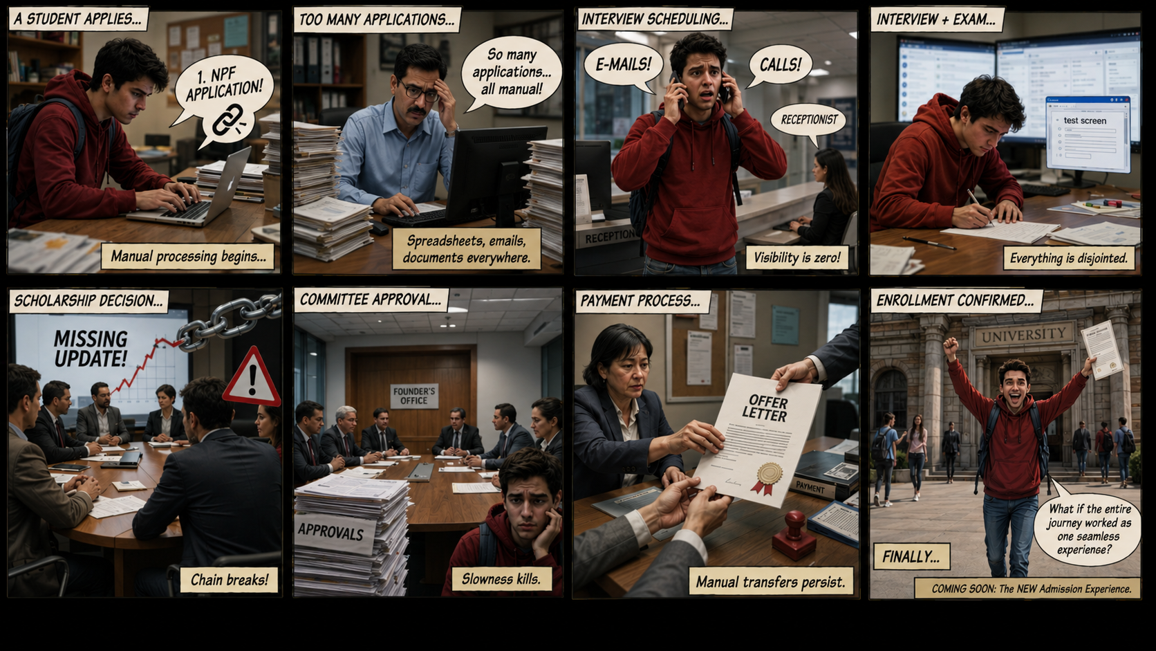
Masters' Union is a tech-first business school that scaled rapidly - but its internal operations couldn't keep pace. Before Dinero, two disconnected systems managed the entire admissions and fee cycle:

Dinero was built to unify this entire journey into one platform - grounded in a single core principle: you don't get to design the solution until you understand the problem.

NPF: captured applications and stored student records.


Pinelab: processed fee payments as an external gateway.
/ The Real 8-Step Manual Journey (Pre-Dinero)
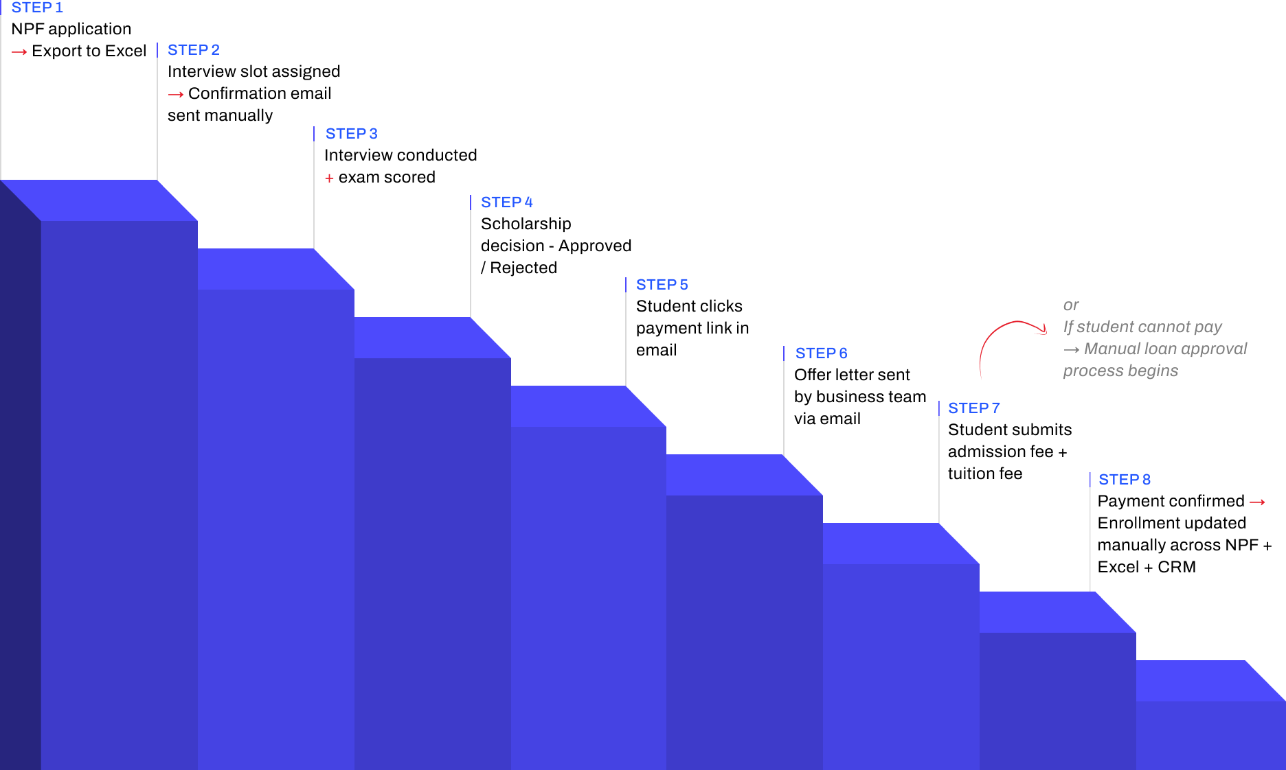
Total overhead: 3–5 hours of non-value-added admin work daily. Every step above = a design opportunity Dinero solved.
/ 1.2 Research Goals

Understand
The end-to-end student journey across all 8 steps from NPF application to enrollment
Identify
The highest-severity pain points across students, admins, and faculty
Define
What a unified platform must do to replace the fragmented NPF + Excel + Pinelab stack
Validate
Design decisions through iterative usability testing before development
Measure
UX quality post-launch using the HEART framework
/ 1.3 Research Questions
Research planning began with 95+ open questions captured during stakeholder kickoffs and admin shadowing. Affinity-mapped into 8 thematic clusters, then distilled to 8 lead questions that drove primary research and testing.
Theme
Lead Research Question
Sub-Qs
Method
Admission Journey
What does the real 8-step admission journey look like and where does it break?
10
Contextual inquiry + stakeholder interviews
Trust & Payment Anxiety
Why do students distrust the Pinelab payment link sent via email?
14
User interviews (laddering)
Admin Efficiency
Where do admins lose the most time across NPF, Excel, and Pinelab?
22
Contextual observation + time-on-task logging
Role-Specific Needs
What information does each role (student, admin, faculty) need and when?
16
Role-based interviews + card sorting
Scholarship & Loan Flows
How do scholarship decisions and loan requests move through people and systems today?
12
Stakeholder interviews + workflow mapping
Cross-System Data Sync
How does student data move (or fail to move) between NPF, Excel, Pinelab, and CRM?
9
Systems audit + admin observation
Task Completion
Can a student complete application → payment → enrollment without admin help, in under 8 minutes?
6
Moderated usability testing (R1 & R2)
Trust Restoration
Does the embedded Pinelab flow reduce abandonment vs. the external email link?
5
A/B testing + post-task interview
/ 1.4 KPIs & Success Metrics
Admin manual effort
0.8 hr/day

−80%


Baseline: 3–5 hrs/day
Target: < 1 hr/day
Payment abandonment
6%
−19 pts
Baseline: ~25%
Target: < 10%
Tool Consolidation
3 →1
−2 platform


Baseline: NPF + Excel + PinelaB
Target: 1 unified
Task success rate
87%

+7 pts vs target


Baseline: 64% (R1)
Target: ≥ 80%
/ 1.6 Participants
5
Students
User interviews · Card sorting · Usability testing (R1 & R2)
3
Admin
Contextual observation · User interviews · Usability testing
3
Faculty
Stakeholder interviews · Workflow validation
/ 1.7 Usability Test Script
"Hi, thank you for joining us. I'm Dhiraj a designer on the Dinero team. We're testing the product today, not you. There are no wrong answers. Please think out loud tell us what you're reading, what you expect, what surprises you. You can stop at any time. Any questions before we begin?"


You've just received your offer letter. Please pay your first semester fee using Dinero.
Scenario 1
Student Payment Flow

Success

Payment completed within 5 minutes · No errors observed
Watch for

Trust hesitation · Confusion on fee breakdown · Missing confirmation states

You just completed your first interview with a candidate. Please update the candidate status to "Shortlisted".
Scenario 2
Admin Candidate Management

Success
Status updated within 30 seconds
Watch for
Navigation path · Search vs. browse behavior · Dead ends
You are a counselor. A student just completed their counseling session with you. Please log your notes and set a follow-up reminder.
Scenario 3
Counselor Follow-up

Success
Note saved · Reminder set within 60 seconds
Watch for
Where they look first · Follow-up cadence selection · Reminder placement
Post-task questions
- How difficult was this task? (1 = very easy to 5 = very hard)
- What was missing that surprised you?
- What did you expect to happen after that action?
- If you could change one thing about that flow, what would it be?
Exit interview questions
- Overall, how does this product compare to the tools you currently use?
- What is the single most important thing this platform does for you?
- What would stop you from using this daily?
/ 1.8 Study Schedule
Oct 2022 – Feb 2023
Week 1–2
Week 3-4
Week 5-6
Week 7-8
Week 9-10
Week 11-12
Week 13–14
Week 15-16
Week 17-18
Stakeholder interviews · Research plan finalisation · Participant recruitment
User interviews Students (5 sessions) · Admin (3 sessions)
User interviews Faculty (3 sessions)
Card sorting
Competitive analysis
Affinity mapping · JTBD framework · Persona development · Journey mapping
Round 1 usability testing 5 participants
Design iteration based on Round 1 findings
Round 2 usability testing Heuristic evaluation
Wireframing · Lo-fi to mid-fi prototype (35 screens)
Hi-fi UI · Design system (30 components) · Figma Dev Mode handoff
/ 2.1 Stakeholder Interviews
Before talking to any end users, we ran alignment sessions with the Product Manager and two Admin Leads. The goal was not to gather requirements it was to understand the business context, the constraints, and how each stakeholder defined success.

60 min
Product Manager
Business goals, success definition, scope constraints

45 min
Admin Lead
Current NPF → CRM workflow, daily pain points, time estimates


45 min
Finance
Payment tracking, reconciliation process, error frequency
Key Tensions Surfaced
- Leadership believed the primary problem was "students not completing payments" research revealed it was a trust design problem, not a student behaviour problem.
- Admins underreported their daily manual effort in initial interviews (said "1–2 hours") contextual observation revealed the real number was 3–5 hours.
- No stakeholder had mapped the full 8-step journey end-to-end before this project it had never been documented in one place.
/ 2.2 Competitive Analysis
Before evaluating the market, we audited what was already in daily use at Masters' Union. These weren't "competitors" — they were the legacy stack Dinero was being built to replace.
Used For
Gap That Drove Dinero

Application intake · student record storage
No workflow operation — admins had to export to Excel for every action

Manual tracking of interview scores · scholarship decisions · payment status
No single source of truth ·
multi-hour daily reconciliation

External fee payment gateway
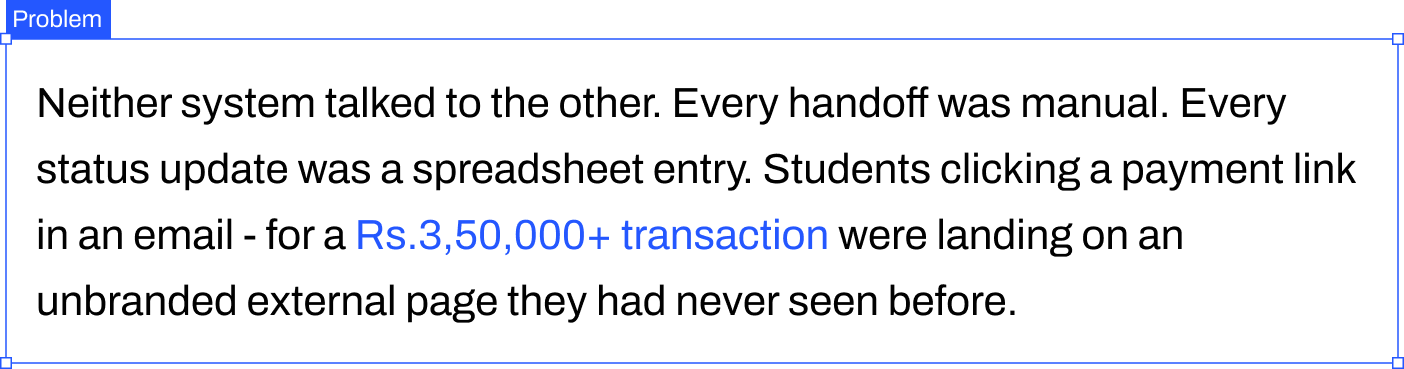
No Masters' Union branding · 14–15 day manual reconciliation · ~25% abandonment
Optimized For
Gap We Observed
Lead capture and applicant CRM for Indian institutions
Strong on intake; limited on post-admission workflows

Global tuition payments with multi-currency and compliance
Strong on payment infra; not built to own admissions lifecycle

Student information systems and reporting (US/UK focus)
Strong on records; required heavy integration for Indian context
/ 2.3 User Interviews
After stakeholder alignment and market audit, we ran 11 semi-structured user interviews across three role groups — students, admins, and faculty — to understand the lived experience of the existing admissions workflow.
Format
Semi-structured · remote via Google Meet · 45–60 min each
Sample
5 students · 3 admins (+ 2 contextual observation sessions in-office) · 3 faculty
Techniques
Open-ended exploration → laddering on payment trust theme → critical incident technique for admin pain
What We Listened For
- Real workflow vs. described workflow (the 1-2 hr vs. 3-5 hr gap surfaced here)
- Emotional language around payment ("phishing," "fake," "scary") that signaled trust gaps
- Workarounds — what users did when the official tool failed them (spreadsheets, WhatsApp, personal email drafts)
- Information needs that varied by role and time of day
Output
200+ individual observations and quotes captured in transcript form — feeding directly into Affinity Mapping (Section 2.4).
/ 2.4 Affinity Mapping
After 11 interviews and 2 contextual observation sessions, we had ~190 individual data points. Every observation, quote and pain point went onto its own sticky note. Then we grouped bottom-up, no predefined categories. The clusters didn't come from analysis. They emerged from the grouping.

Total: 188 notes clustered across 5 themes
/ Jobs to Be Done
JTBD moves the conversation away from features and toward motivation. Instead of "what do users want?", you ask: what job are they hiring this product to do?
User
When I…
I want to…
So I can…
ADMIN
Start my workday
See every pending action in one view
Stop opening NPF, Pinelab and Excel
ADMIN
Update a student status
Do it in one click with confirmation
Move to the next task immediately
Faculty
Finish a counseling session
Log notes right there in the platform
Not lose context or forget follow-ups
STUDENt
Check my admission status
See it instantly - no emails
Stop anxiously checking my inbox
STUDENt
Pay my semester fee
Complete it inside one trusted platform
Have proof and peace of mind
/ 2.5 User Personas - 3 Research-Backed Roles
These personas were built directly from interview data - not from assumptions. Every goal, pain point and JTBD below was mentioned by at least 2 of the participants in that role group.

Aditya Verma
MBA Student - Age: 22
Aditya is a driven MBA student focused on securing a great job post-graduation, but he finds the admission and financial process confusing. He struggles to track interview progress, fee payments and counselor feedback - often missing important updates. He prefers digital solutions but gets frustrated when he has to check multiple platforms. He wants one place where everything just works.
Goals
→
Track interview progress and feedback in real time - no more waiting for email updates
→
Pay fees quickly without worrying about third-party links or whether payment went through
→
Access counselor reports and meeting history in one place
→
Join clubs and events without long approval processes or scattered notifications
Pain Points
×
Confusing interview process - unclear next steps, no visibility into stage
×
Third-party payment issues - external link felt untrustworthy, no receipt
×
Scattered feedback from counselors - difficult to access reports from previous sessions

HEARS
→
You need to pay your fees via this third-party link.
→
Your interview status will be updated soon.
→
You missed the deadline for your counselor feedback session.

SEES
Multiple emails from admissions with unclear instructions. Screenshots and spreadsheets to track interview progress. Other students discussing the process in WhatsApp groups.

SAYS & DOES
→
Where do I check my interview status?
→
Did my payment go through? How do I get a receipt?
→
Asks peers for updates. Logs into multiple platforms.

THINKS & FEELS
→
I wish there was one place to track everything.
→
Why do I need to use third-party payment links?
→
Am I missing important deadlines?

Priya Sharma
Admissions & Finance Administrator - Age: 42
Priya is responsible for managing student admissions, financial records and interview tracking. She works with multiple tools daily to approve applications, verify transactions and track refund requests. The lack of a centralized system makes her job exhausting - she handles 2-4 data discrepancy errors daily across NPF, Pinelab, Excel and email.
Goals
→
Streamline the admission approval process to reduce manual work
→
Get real-time insights into student finances, transactions and interview status
→
Automate fee processing and refunds to avoid delays and student complaints
→
Ensure data accuracy in reports without switching between multiple platforms
Pain Points
×
Too many manual approvals - time-consuming and error-prone
×
Scattered data across NPF, Pinelab, Excel and email - hard to get a complete student picture
×
Delayed fee verification and refund processing - leading to daily student complaints
×
No single dashboard for managing student interactions across all touchpoints
HEARS
→
We need to approve 50+ applications today
→
How many students have completed fee payments?
→
Students are complaining about missing payment confirmations

SEES
Multiple spreadsheets tracking student fee payments. Unorganized email requests for refund approvals. Confusion about fee statuses across different platforms.

SAYS & DOES
→
I need to check multiple systems to track student applications
→
Tracks counselor interactions separately from financial records. Compiles manual reports each morning.

THINKS & FEELS
→
There must be a better way to manage all of this.
→
I spend 4 hours a day just reconciling data.
→
Why can't I see a student's full journey in one place?

Dr. Rajeev Menon
Faculty & Student Counselor- Age: 40
Dr. Rajeev Menon has been mentoring students for over a decade, helping them navigate academic and career paths. Without a structured system, his feedback gets lost in emails. He struggles to track student engagement across counseling sessions and has no way to flag at-risk students early.
Goals
→
Provide timely and structured feedback to students after interviews and sessions
→
Have a centralized system to track student history, progress and counselor interactions
→
Improve student engagement in career mentorship and academic guidance
→
Reduce the need for manual note-keeping and fragmented communication
Pain Points
×
No centralized student tracking system - feedback often gets lost in email drafts
×
Manual documentation is inefficient and takes too much time between sessions
×
Hard to ensure students are following up on counseling sessions and interview feedback
HEARS
→
Can you check in on this student? I think they're struggling
→
Your session notes weren't attached to the student record
→
A student from last month missed their follow-up.
SEES
No structured view of students he has counseled. Emails as the only record system. Students re-explaining context he should already know.
SAYS & DOES
→
My session notes live in my professional email drafts.
→
I have to reconstruct context from memory each time
→
Manually tracks follow-ups in a personal notebook.
THINKS & FEELS
→
I'm losing context between sessions - I can't be an effective mentor this way.
→
I want to flag at-risk students but there's no channel
→
This should all be in one place.
/ 2.6 User journey
With personas defined, we mapped each user's end-to-end journey through the existing admissions workflow — capturing actions, touchpoints, emotional state, and opportunities at each stage.
1 · Intake
2 · Scheduling
3 · Interview
4 · Decision
5 · Offer
6 · Payment
7 · Enrollment
Student
Submit application
via website
Complete?
Incomplete-docs email


Wait for slot
Slot invite received
email + Calendar
Attend interview
video / in-person
No-show
Admissions decision
Full 100%
Partial 25–75%
No scholarship
Rejected
Reschedule
Receive offer letter
Branded · MU
Accept?
Decline / lapse 7d
Payment path
Pinelab (full)
Loan / EMI
Deposit 1/3·1/6·1/12
Payment failed (x3)
Abandoned >24h
Enrolled — Dashboard
Admin
Upload CSV from NPF
batch · weekly
CSV validation error
Schedule + send invites
bulk · 1-click
Track interview status
live dashboard
Faculty no-show — reassign
Decision Board
panel + admin
Tie-break: founder
Auto-trigger offer letter
branded · 1-click
Track payments
real-time
Auto-sync
NPF + CRM + Excel
Sync conflict — manual merge
Faculty
Score candidate
Score overdue >48h
Student
Admin
Faculty
Decision ◇
Success end
Edge case
Critical edge
5 critical handoff moments — where student & admin lanes interact
H1 · Application
Admin CSV → Student Portal
⚠ Duplicate / invalid row
H2 · Slot Invite
Scheduler → Student inbox
⚠ Wrong tz / bounce
H3 · Decision
Faculty + Admin → Student
⚠ Same-day SLA miss
H4 · Offer Letter
Admin → Student (Pinelab)
⚠ Un-branded (legacy)
H5 · Payment confirm
Pinelab → CRM/NPF/Excel
⚠ Sync race condition
/ 2.7 User Flow
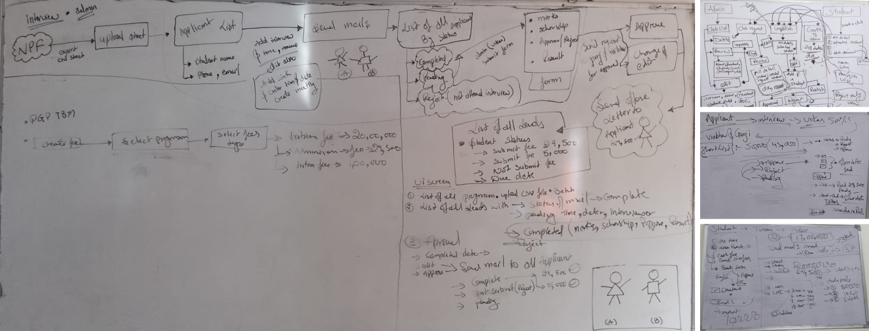
Information architecture for Dinero emerged through participant-led grouping during user interviews and the affinity mapping process (Section 2.4). Rather than running formal card sorting with end users, IA categories surfaced organically — and were then validated in an internal design-team workshop before wireframing.
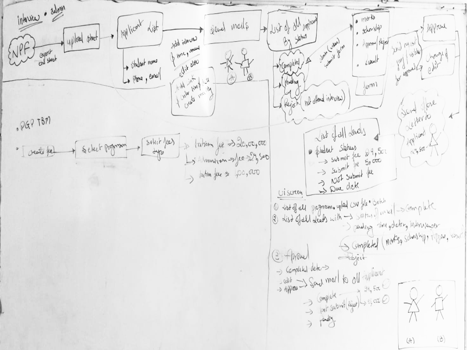
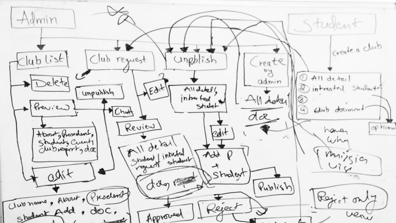
/ 2.8 Information architecture
Information architecture for Dinero emerged through participant-led grouping during user interviews and the affinity mapping process (Section 2.4). Rather than running formal card sorting with end users, IA categories surfaced organically — and were then validated in an internal design-team workshop before wireframing.
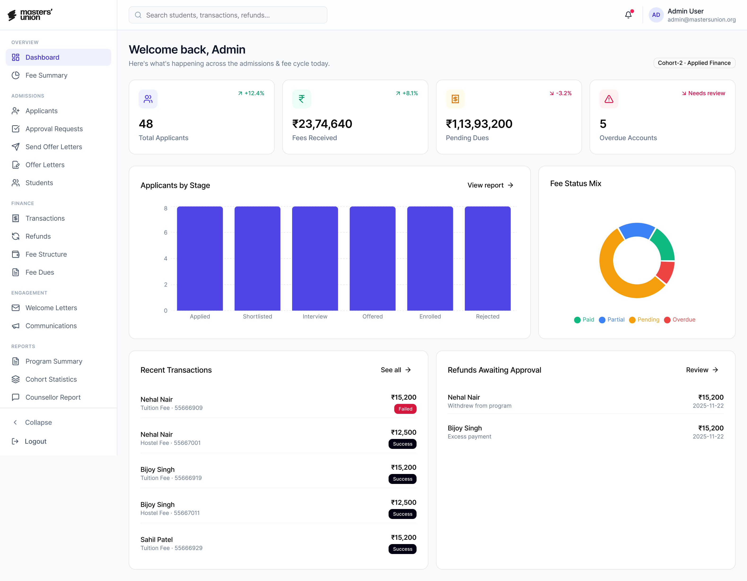
Step 1
Applied Finance Cohort View
Sketch intent
admin dashboard with cohort rows, expandable program categories, and a single CTA to create program
What changed in hi-fi
added cohort summary actions, refresh cashflow control, and clear program/cohort hierarchy in the navigation

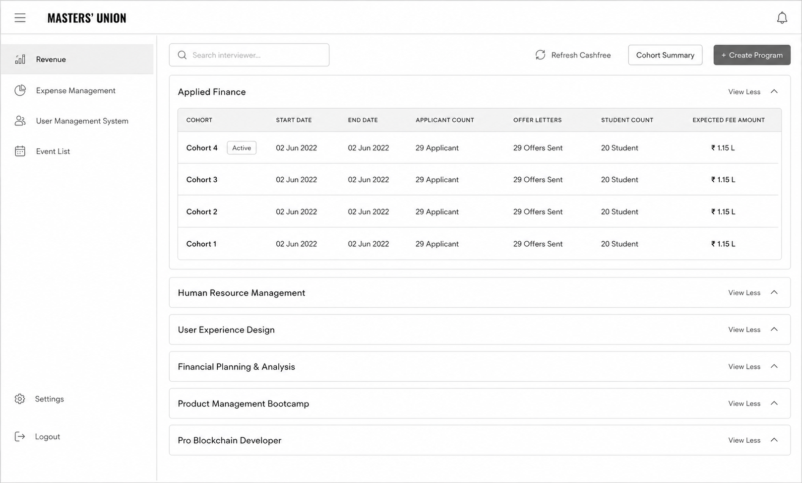
Result: single-screen view replaced cross-tab NPF + Excel reconciliation

/ 2.9 Usability Testing
Usability testing ran in two rounds, four weeks apart. Round 1 tested the mid-fi prototype against the three scenarios from Section 1.7. Round 2 tested the hi-fi build after iteration. The goal wasn't to confirm we'd built it right — it was to find what was broken while fixes were still cheap.
Metric
Round 1 (Mid-fi)
Round 2 (Hi-fi)
Fidelity
Mid-fi Figma prototype
Hi-fi production-spec build
Participants
5 (3 students · 1 admin · 1 faculty)
--
Task success rate
64%
87%
Critical issues surfaced
7
--
Method
- Moderated remote sessions via Google Meet · screen-share with think-aloud protocol
- Three scenarios per participant (Student payment · Admin candidate management · Counselor follow-up)
- Success criteria pre-defined per scenario (time + error count)
- Post-task SEQ rating · Exit interview at end of session
- Recordings transcribed and tagged by theme · findings clustered by severity
/ 2.10 Data Collected
The full data corpus produced during the research and design phase of Dinero. Every artifact below is traceable to a section in this case study.
Section
Artifact
Count / Detail
2.1
Stakeholder interview transcripts
3 sessions · 2.5 hours total
2.3
User interview transcripts
11 sessions · ~10 hours total
2.3
Contextual observation notes
2 in-office sessions
2.4
Raw research observations
~190 individual data points
2.4
Affinity clusters
5 themes · 188 notes mapped
2.5
User personas (research-backed)
3 personas · 1 per role group
2.6
Journey maps
3 visuals (current · future · swimlane)
2.7
IA categories
5 top-level · validated cross-role
2.8
Wireframe sketches
9 notebook + 3 whiteboard sessions
2.8
Production screens (Figma)
35 screens · mid-fi to hi-fi
2.8
Design system components
30 components · token-based
2.9
Usability test recordings
Round 1 + Round 2 · transcribed + tagged
/ 3.1 Identify Patterns
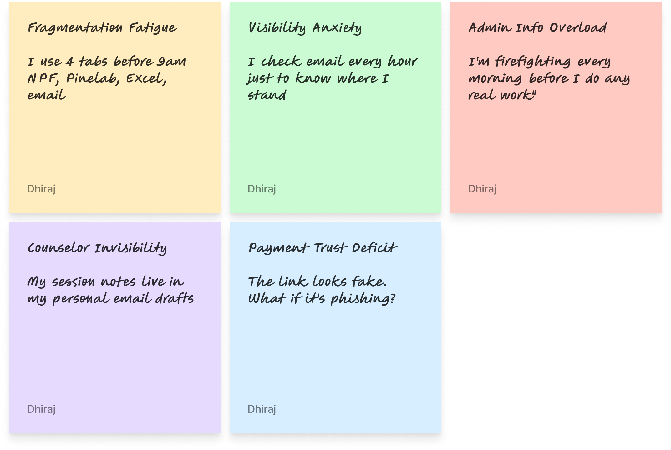
Pattern recognition in this project worked at two levels. First — within each role: what did students consistently say? What did admins consistently do? Second — across roles: what showed up in 2 or more groups despite different vocabularies?

Fragmentation Fatigue
Admin role · 48 notes · multi-tab workflow described as exhausting

Visibility Anxiety
Student role · 41 notes · inbox-checking and peer-comparison behavior

Admin Info Overload
Admin role · 41 notes · firefighting before real work

Counselor Invisibility
Faculty role · 32 notes · session notes lost in email drafts

Payment Trust Deficit
Student role · 26 notes · "phishing" language unprompted
Cross-role signals
Workaround behavior every role described using non-sanctioned tools (personal spreadsheets, WhatsApp, email drafts) when the official system failed them. The workaround was the unmet need.

Information needs varied by time of day admins needed cohort view in the morning, individual student view in the afternoon. Students needed status visibility immediately after major touchpoints.

Trust as design students and admins both described moments of "is this real?" Trust signals (branding, confirmation, receipts) mattered as much as functional design.

/ 4.1 Sprint Planning
Research surfaces problems. Sprints translate those problems into shippable design decisions. The hardest discipline in this phase wasn't generating ideas — it was protecting research priorities from feature creep when stakeholders asked for "just one more thing."
/ 4.2 Final UI
The final UI is the most visible artifact of this case study — but it is the least important one until everything before it has been understood. The screens shipped because the research justified them, the wireframing tested them, and the design system made them coherent.
/ 4.3 Impact
Five months of research and design produced four measurable changes in how Masters' Union runs admissions. Each metric ties to a specific design decision documented earlier.
TASK SUCCESS RATE
87%
+23 pts
Baseline: 64% · R2 result: 87%
PAYMENT COMPLETION
93%
+19 pts
Baseline: ~74% (1 − 25% abandonment)
PAYMENT ABANDONMENT
6%
−19 pts
Baseline: ~25% · Target: <10%
Target: < 1 hr/day
ADMIN MANUAL EFFORT
<1 hr/day
−80%
Baseline: 3–5 hrs/day
/ 4.4 Core Learnings
After organising data by role, cross-role synthesis revealed 5 patterns that cut across all three user groups. Each appeared in at least 2 of 3 roles.
01
Stakeholders misattribute problems research locates them
Leadership came in believing the problem was students not completing payments. Research revealed it was a trust design failure: students were willing to pay, but the experience made them feel unsafe. The fix wasn't a reminder email it was embedding the gateway. This project taught me to hold the question open longer before accepting a stakeholder's problem definition.
02
Observation reveals what interviews cannot
Admins told us in interviews they spent 1-2 hours on daily overhead. Contextual observation showed the real number was 3-5 hours. They weren't lying - they had normalized the effort and lost calibration on how long tasks actually took. Self-report and observation are different data sources. Both are necessary. This project made me default to observation-first for workflow-heavy user groups.
03
Card sorting isn't just an IA exercise - it's a conflict resolution tool
When I proposed role-based dashboards in early stakeholder reviews, the PM pushed back: Can't we just have one view with filters? The card sorting data ended that conversation. Participants didn't group the same cards the same way - the data made the case I couldn't make from intuition alone. Using research as a decision-making tool, not just a discovery tool, is the shift this project crystallized.
04
Test early enough to fail cheaply
Round 1 testing at mid-fi found 7 critical issues before a single line of code was written. The cost to fix those in Figma was hours. The cost to fix them post-development would have been weeks. The 63% -> 87% improvement wasn't just a UX win - it was a product risk mitigation. This is the argument I now use internally when engineering timelines push back against early testing.
05
The design system is a research artifact, not just a component library
The 30-component token-based system wasn't built for aesthetic consistency - it was built because 3 role-based dashboards serving different mental models still needed to feel like one product. Every token decision (colour, spacing, type) was constrained by the requirement that all 3 roles could trust the same visual language while having completely different information architectures. The system encoded the research.
I live for flow-that sweet spot where creativity meets clarity.
View Resume


@imdhirajchouhan
Back to Top

नमस्कार
I’m Dhiraj Chouhan
I’m Dhiraj Chouhan
Download Resume

The research process documented in this case study - the user interviews, card sorting, contextual observation, affinity mapping, usability testing and A/B testing - was conducted as described. Dinero was a real, 2-year product built and shipped at Masters' Union. Some specific data values, feedback quotes and metrics shown have been modified or made representative to protect participant privacy and institutional data confidentiality. The insights, findings and design decisions accurately reflect what was discovered during the research.
Back to Home Page
Dinero
Internal Platform
for Masters' Union
UX Research Case Study
From an 8-step manual admissions journey to a unified platform - serving 1,000+ students, eliminating 3–5 hours of daily admin overhead and converting an external payment link into 93% in-app completion.
USER RESEARCH
Product Design
Double Diamond
EdTech
1,000+
Students Onboarded
87%
Usability Task Success
93%
Payment Completion (A/B)
<1 hr
Admin Daily Overhead
Author
Dhiraj Chouhan
Framework
Double Diamond
HEART Framework
GSM Model
Study Type
Mixed Methods: Generative + Evaluative Research
Timeline
2021 – 2023
Reformatted 2025
Team
1 PM · 3 UX/UI Designers · 8 Engineers · 2 QA
Tools Used
/ 1.1 Project Background
Masters' Union is a tech-first business school that scaled rapidly - but its internal operations couldn't keep pace. Before Dinero, two disconnected systems managed the entire admissions and fee cycle:
Dinero was built to unify this entire journey into one platform - grounded in a single core principle: you don't get to design the solution until you understand the problem.
NPF: captured applications and stored student records.
Pinelab: processed fee payments as an external gateway.
/ The Real 8-Step Manual Journey (Pre-Dinero)
Total overhead: 3–5 hours of non-value-added admin work daily. Every step above = a design opportunity Dinero solved.
/ 1.2 Research Goals
Understand
The end-to-end student journey across all 8 steps from NPF application to enrollment
Identify
The highest-severity pain points across students, admins, and faculty
Define
What a unified platform must do to replace the fragmented NPF + Excel + Pinelab stack
Validate
Design decisions through iterative usability testing before development
Measure
UX quality post-launch using the HEART framework
/ 1.3 Research Questions
Research planning began with 95+ open questions captured during stakeholder kickoffs and admin shadowing. Affinity-mapped into 8 thematic clusters, then distilled to 8 lead questions that drove primary research and testing.
Theme
Lead Research Question
Sub-Qs
Method
Admission Journey
What does the real 8-step admission journey look like and where does it break?
10
Contextual inquiry + stakeholder interviews
Trust & Payment Anxiety
Why do students distrust the Pinelab payment link sent via email?
14
User interviews (laddering)
Admin Efficiency
Where do admins lose the most time across NPF, Excel, and Pinelab?
22
Contextual observation + time-on-task logging
Role-Specific Needs
What information does each role (student, admin, faculty) need and when?
16
Role-based interviews + card sorting
Scholarship & Loan Flows
How do scholarship decisions and loan requests move through people and systems today?
12
Stakeholder interviews + workflow mapping
Cross-System Data Sync
How does student data move (or fail to move) between NPF, Excel, Pinelab, and CRM?
9
Systems audit + admin observation
Task Completion
Can a student complete application → payment → enrollment without admin help, in under 8 minutes?
6
Moderated usability testing (R1 & R2)
Trust Restoration
Does the embedded Pinelab flow reduce abandonment vs. the external email link?
5
A/B testing + post-task interview
/ 1.4 KPIs & Success Metrics
Admin manual effort
0.8 hr/day
−80%
Baseline: 3–5 hrs/day
Target: < 1 hr/day
Payment abandonment
6%
−19 pts
Baseline: ~25%
Target: < 10%
Tool Consolidation
3 →1
−2 platform
Baseline: NPF + Excel + PinelaB
Target: 1 unified
Task success rate
87%
+7 pts vs target
Baseline: 64% (R1)
Target: ≥ 80%
/ 1.6 Participants
5
Students
User interviews · Card sorting · Usability testing (R1 & R2)
3
Admin
Contextual observation · User interviews · Usability testing
3
Faculty
Stakeholder interviews · Workflow validation
/ 1.7 Usability Test Script
"Hi, thank you for joining us. I'm Dhiraj a designer on the Dinero team. We're testing the product today, not you. There are no wrong answers. Please think out loud tell us what you're reading, what you expect, what surprises you. You can stop at any time. Any questions before we begin?"

You've just received your offer letter. Please pay your first semester fee using Dinero.
Scenario 1
Student Payment Flow
Success
Payment completed within 5 minutes · No errors observed
Watch for
Trust hesitation · Confusion on fee breakdown · Missing confirmation states

You just completed your first interview with a candidate. Please update the candidate status to "Shortlisted".
Scenario 2
Admin Candidate Management
Success
Status updated within 30 seconds
Watch for
Navigation path · Search vs. browse behavior · Dead ends
You are a counselor. A student just completed their counseling session with you. Please log your notes and set a follow-up reminder.
Scenario 3
Counselor Follow-up
Success
Note saved · Reminder set within 60 seconds
Watch for
Where they look first · Follow-up cadence selection · Reminder placement
Post-task questions
- How difficult was this task? (1 = very easy to 5 = very hard)
- What was missing that surprised you?
- What did you expect to happen after that action?
- If you could change one thing about that flow, what would it be?
Exit interview questions
- Overall, how does this product compare to the tools you currently use?
- What is the single most important thing this platform does for you?
- What would stop you from using this daily?
/ 1.8 Study Schedule
Oct 2022 – Feb 2023
Week 1–2
Week 3-4
Week 5-6
Week 7-8
Week 9-10
Week 11-12
Week 13–14
Week 15-16
Week 17-18
Stakeholder interviews · Research plan finalisation · Participant recruitment
User interviews Students (5 sessions) · Admin (3 sessions)
User interviews Faculty (3 sessions)
Card sorting
Competitive analysis
Affinity mapping · JTBD framework · Persona development · Journey mapping
Round 1 usability testing 5 participants
Design iteration based on Round 1 findings
Round 2 usability testing Heuristic evaluation
Wireframing · Lo-fi to mid-fi prototype (35 screens)
Hi-fi UI · Design system (30 components) · Figma Dev Mode handoff
/ 2.1 Stakeholder Interviews
Before talking to any end users, we ran alignment sessions with the Product Manager and two Admin Leads. The goal was not to gather requirements it was to understand the business context, the constraints, and how each stakeholder defined success.
60 min
Product Manager
Business goals, success definition, scope constraints
45 min

Admin Lead
Current NPF → CRM workflow, daily pain points, time estimates
45 min


Finance
Payment tracking, reconciliation process, error frequency
Key Tensions Surfaced
- Leadership believed the primary problem was "students not completing payments" research revealed it was a trust design problem, not a student behaviour problem.
- Admins underreported their daily manual effort in initial interviews (said "1–2 hours") contextual observation revealed the real number was 3–5 hours.
- No stakeholder had mapped the full 8-step journey end-to-end before this project it had never been documented in one place.
/ 2.2 Competitive Analysis
Before evaluating the market, we audited what was already in daily use at Masters' Union. These weren't "competitors" — they were the legacy stack Dinero was being built to replace.
Used For
Gap That Drove Dinero
Application intake · student record storage
No workflow operation — admins had to export to Excel for every action
Manual tracking of interview scores · scholarship decisions · payment status
No single source of truth ·
multi-hour daily reconciliation
External fee payment gateway
No Masters' Union branding · 14–15 day manual reconciliation · ~25% abandonment
Optimized For
Gap We Observed
Lead capture and applicant CRM for Indian institutions
Strong on intake; limited on post-admission workflows
Global tuition payments with multi-currency and compliance
Strong on payment infra; not built to own admissions lifecycle
Student information systems and reporting (US/UK focus)
Strong on records; required heavy integration for Indian context
/ 2.3 User Interviews
After stakeholder alignment and market audit, we ran 11 semi-structured user interviews across three role groups — students, admins, and faculty — to understand the lived experience of the existing admissions workflow.
Format
Semi-structured · remote via Google Meet · 45–60 min each
Sample
5 students · 3 admins (+ 2 contextual observation sessions in-office) · 3 faculty
Techniques
Open-ended exploration → laddering on payment trust theme → critical incident technique for admin pain
What We Listened For
- Real workflow vs. described workflow (the 1-2 hr vs. 3-5 hr gap surfaced here)
- Emotional language around payment ("phishing," "fake," "scary") that signaled trust gaps
- Workarounds — what users did when the official tool failed them (spreadsheets, WhatsApp, personal email drafts)
- Information needs that varied by role and time of day
Output
200+ individual observations and quotes captured in transcript form — feeding directly into Affinity Mapping (Section 2.4).
/ 2.4 Affinity Mapping
After 11 interviews and 2 contextual observation sessions, we had ~190 individual data points. Every observation, quote and pain point went onto its own sticky note. Then we grouped bottom-up, no predefined categories. The clusters didn't come from analysis. They emerged from the grouping.

Total: 188 notes clustered across 5 themes
/ Jobs to Be Done
JTBD moves the conversation away from features and toward motivation. Instead of "what do users want?", you ask: what job are they hiring this product to do?
User
When I…
I want to…
So I can…
ADMIN
Start my workday
See every pending action in one view
Stop opening NPF, Pinelab and Excel
ADMIN
Update a student status
Do it in one click with confirmation
Move to the next task immediately
Faculty
Finish a counseling session
Log notes right there in the platform
Not lose context or forget follow-ups
STUDENt
Check my admission status
See it instantly - no emails
Stop anxiously checking my inbox
STUDENt
Pay my semester fee
Complete it inside one trusted platform
Have proof and peace of mind
/ 2.5 User Personas - 3 Research-Backed Roles
These personas were built directly from interview data - not from assumptions. Every goal, pain point and JTBD below was mentioned by at least 2 of the participants in that role group.

Aditya Verma
MBA Student - Age: 22
Aditya is a driven MBA student focused on securing a great job post-graduation, but he finds the admission and financial process confusing. He struggles to track interview progress, fee payments and counselor feedback - often missing important updates. He prefers digital solutions but gets frustrated when he has to check multiple platforms. He wants one place where everything just works.
Goals
→
Track interview progress and feedback in real time - no more waiting for email updates
→
Pay fees quickly without worrying about third-party links or whether payment went through
→
Access counselor reports and meeting history in one place
→
Join clubs and events without long approval processes or scattered notifications
Pain Points
×
Confusing interview process - unclear next steps, no visibility into stage
×
Third-party payment issues - external link felt untrustworthy, no receipt
×
Scattered feedback from counselors - difficult to access reports from previous sessions

HEARS
→
You need to pay your fees via this third-party link.
→
Your interview status will be updated soon.
→
You missed the deadline for your counselor feedback session.

SEES
Multiple emails from admissions with unclear instructions. Screenshots and spreadsheets to track interview progress. Other students discussing the process in WhatsApp groups.

SAYS & DOES
→
Where do I check my interview status?
→
Did my payment go through? How do I get a receipt?
→
Asks peers for updates. Logs into multiple platforms.

THINKS & FEELS
→
I wish there was one place to track everything.
→
Why do I need to use third-party payment links?
→
Am I missing important deadlines?

Priya Sharma
Admissions & Finance Administrator - Age: 42
Priya is responsible for managing student admissions, financial records and interview tracking. She works with multiple tools daily to approve applications, verify transactions and track refund requests. The lack of a centralized system makes her job exhausting - she handles 2-4 data discrepancy errors daily across NPF, Pinelab, Excel and email.
Goals
→
Streamline the admission approval process to reduce manual work
→
Get real-time insights into student finances, transactions and interview status
→
Automate fee processing and refunds to avoid delays and student complaints
→
Ensure data accuracy in reports without switching between multiple platforms
Pain Points
×
Too many manual approvals - time-consuming and error-prone
×
Scattered data across NPF, Pinelab, Excel and email - hard to get a complete student picture
×
Delayed fee verification and refund processing - leading to daily student complaints
×
No single dashboard for managing student interactions across all touchpoints
HEARS
→
We need to approve 50+ applications today
→
How many students have completed fee payments?
→
Students are complaining about missing payment confirmations

SEES
Multiple spreadsheets tracking student fee payments. Unorganized email requests for refund approvals. Confusion about fee statuses across different platforms.

SAYS & DOES
→
I need to check multiple systems to track student applications
→
Tracks counselor interactions separately from financial records. Compiles manual reports each morning.

THINKS & FEELS
→
There must be a better way to manage all of this.
→
I spend 4 hours a day just reconciling data.
→
Why can't I see a student's full journey in one place?

Dr. Rajeev Menon
Faculty & Student Counselor- Age: 40
Dr. Rajeev Menon has been mentoring students for over a decade, helping them navigate academic and career paths. Without a structured system, his feedback gets lost in emails. He struggles to track student engagement across counseling sessions and has no way to flag at-risk students early.
Goals
→
Provide timely and structured feedback to students after interviews and sessions
→
Have a centralized system to track student history, progress and counselor interactions
→
Improve student engagement in career mentorship and academic guidance
→
Reduce the need for manual note-keeping and fragmented communication
Pain Points
×
No centralized student tracking system - feedback often gets lost in email drafts
×
Manual documentation is inefficient and takes too much time between sessions
×
Hard to ensure students are following up on counseling sessions and interview feedback
HEARS
→
Can you check in on this student? I think they're struggling
→
Your session notes weren't attached to the student record
→
A student from last month missed their follow-up.
SEES
No structured view of students he has counseled. Emails as the only record system. Students re-explaining context he should already know.
SAYS & DOES
→
My session notes live in my professional email drafts.
→
I have to reconstruct context from memory each time
→
Manually tracks follow-ups in a personal notebook.
THINKS & FEELS
→
I'm losing context between sessions - I can't be an effective mentor this way.
→
I want to flag at-risk students but there's no channel
→
This should all be in one place.
/ 2.6 User journey
With personas defined, we mapped each user's end-to-end journey through the existing admissions workflow — capturing actions, touchpoints, emotional state, and opportunities at each stage.
1 · Intake
2 · Scheduling
3 · Interview
4 · Decision
5 · Offer
6 · Payment
7 · Enrollment
Student
Submit application
via website
Complete?
Incomplete-docs email
Wait for slot
Slot invite received
email + Calendar
Attend interview
video / in-person
No-show
Admissions decision
Full 100%
Partial 25–75%
No scholarship
Rejected
Reschedule
Receive offer letter
Branded · MU
Accept?
Decline / lapse 7d
Payment path
Pinelab (full)
Loan / EMI
Deposit 1/3·1/6·1/12
Payment failed (x3)
Abandoned >24h
Enrolled — Dashboard
Admin
Upload CSV from NPF
batch · weekly
CSV validation error
Schedule + send invites
bulk · 1-click
Track interview status
live dashboard
Faculty no-show — reassign
Decision Board
panel + admin
Tie-break: founder
Auto-trigger offer letter
branded · 1-click
Track payments
real-time
Auto-sync
NPF + CRM + Excel
Sync conflict — manual merge
Faculty
Score candidate
Score overdue >48h
Student
Admin
Faculty
Decision ◇
Success end
Edge case
Critical edge
5 critical handoff moments — where student & admin lanes interact
H1 · Application
Admin CSV → Student Portal
⚠ Duplicate / invalid row
H2 · Slot Invite
Scheduler → Student inbox
⚠ Wrong tz / bounce
H3 · Decision
Faculty + Admin → Student
⚠ Same-day SLA miss
H4 · Offer Letter
Admin → Student (Pinelab)
⚠ Un-branded (legacy)
H5 · Payment confirm
Pinelab → CRM/NPF/Excel
⚠ Sync race condition
/ 2.7 User Flow
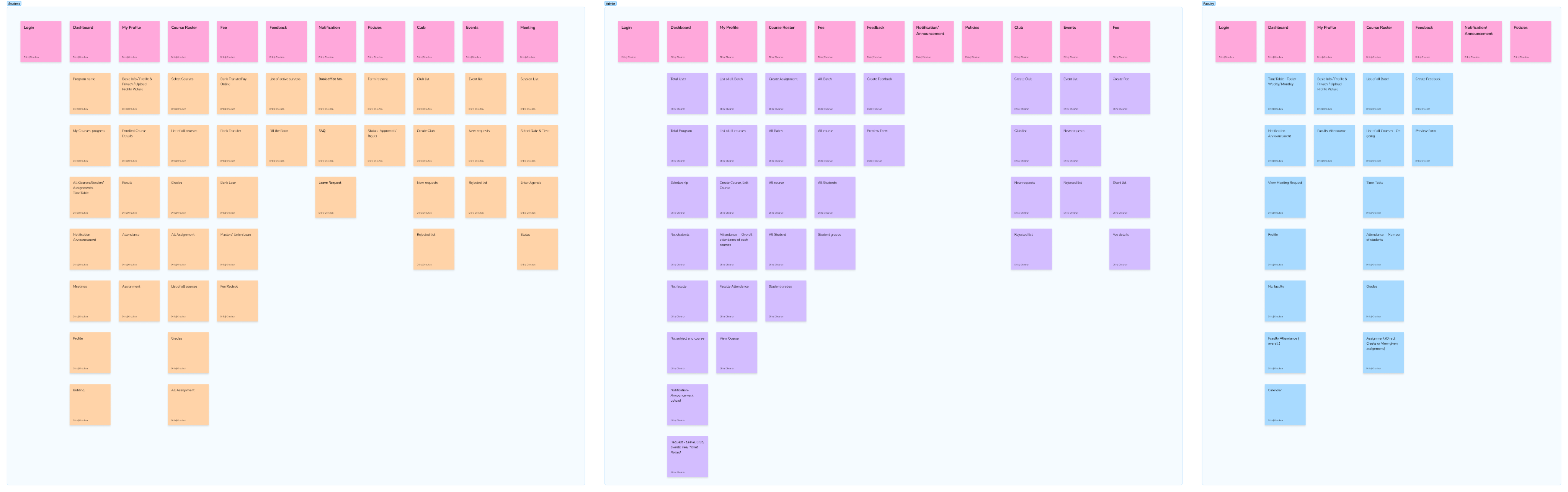
Information architecture for Dinero emerged through participant-led grouping during user interviews and the affinity mapping process (Section 2.4). Rather than running formal card sorting with end users, IA categories surfaced organically — and were then validated in an internal design-team workshop before wireframing.
/ 2.8 Information architecture
Information architecture for Dinero emerged through participant-led grouping during user interviews and the affinity mapping process (Section 2.4). Rather than running formal card sorting with end users, IA categories surfaced organically — and were then validated in an internal design-team workshop before wireframing.
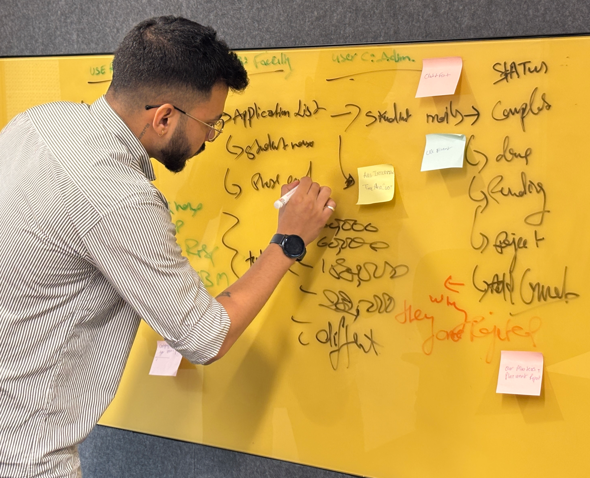
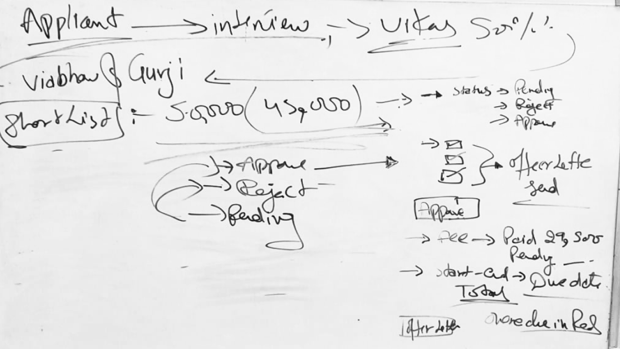
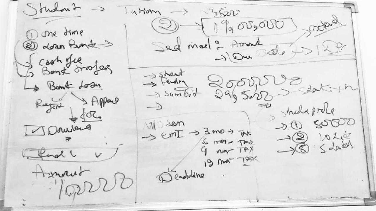
Step 1
Applied Finance Cohort View
Sketch intent
admin dashboard with cohort rows, expandable program categories, and a single CTA to create program
What changed in hi-fi
added cohort summary actions, refresh cashflow control, and clear program/cohort hierarchy in the navigation
Result: single-screen view replaced cross-tab NPF + Excel reconciliation
/ 2.9 Usability Testing
Usability testing ran in two rounds, four weeks apart. Round 1 tested the mid-fi prototype against the three scenarios from Section 1.7. Round 2 tested the hi-fi build after iteration. The goal wasn't to confirm we'd built it right — it was to find what was broken while fixes were still cheap.
Metric
Round 1 (Mid-fi)
Round 2 (Hi-fi)
Fidelity
Mid-fi Figma prototype
Hi-fi production-spec build
Participants
5 (3 students · 1 admin · 1 faculty)
--
Task success rate
64%
87%
Critical issues surfaced
7
--
Method
- Moderated remote sessions via Google Meet · screen-share with think-aloud protocol
- Three scenarios per participant (Student payment · Admin candidate management · Counselor follow-up)
- Success criteria pre-defined per scenario (time + error count)
- Post-task SEQ rating · Exit interview at end of session
- Recordings transcribed and tagged by theme · findings clustered by severity
/ 2.10 Data Collected
The full data corpus produced during the research and design phase of Dinero. Every artifact below is traceable to a section in this case study.
Section
Artifact
Count / Detail
2.1
Stakeholder interview transcripts
3 sessions · 2.5 hours total
2.3
User interview transcripts
11 sessions · ~10 hours total
2.3
Contextual observation notes
2 in-office sessions
2.4
Raw research observations
~190 individual data points
2.4
Affinity clusters
5 themes · 188 notes mapped
2.5
User personas (research-backed)
3 personas · 1 per role group
2.6
Journey maps
3 visuals (current · future · swimlane)
2.7
IA categories
5 top-level · validated cross-role
2.8
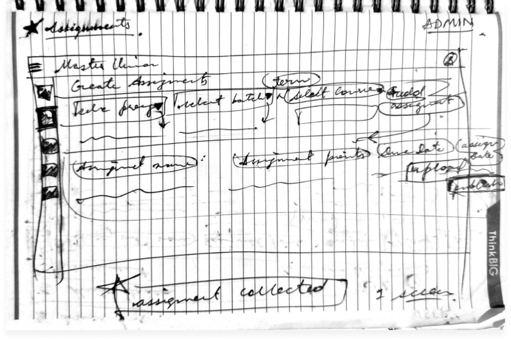
Wireframe sketches
9 notebook + 3 whiteboard sessions
2.8
Production screens (Figma)
35 screens · mid-fi to hi-fi
2.8
Design system components
30 components · token-based
2.9
Usability test recordings
Round 1 + Round 2 · transcribed + tagged
/ 3.1 Identify Patterns
Pattern recognition in this project worked at two levels. First — within each role: what did students consistently say? What did admins consistently do? Second — across roles: what showed up in 2 or more groups despite different vocabularies?
Fragmentation Fatigue
Admin role · 48 notes · multi-tab workflow described as exhausting
Visibility Anxiety
Student role · 41 notes · inbox-checking and peer-comparison behavior
Admin Info Overload
Admin role · 41 notes · firefighting before real work
Counselor Invisibility
Faculty role · 32 notes · session notes lost in email drafts
Payment Trust Deficit
Student role · 26 notes · "phishing" language unprompted
Cross-role signals
Workaround behavior every role described using non-sanctioned tools (personal spreadsheets, WhatsApp, email drafts) when the official system failed them. The workaround was the unmet need.

Information needs varied by time of day admins needed cohort view in the morning, individual student view in the afternoon. Students needed status visibility immediately after major touchpoints.
Trust as design students and admins both described moments of "is this real?" Trust signals (branding, confirmation, receipts) mattered as much as functional design.

/ 4.1 Sprint Planning
Research surfaces problems. Sprints translate those problems into shippable design decisions. The hardest discipline in this phase wasn't generating ideas — it was protecting research priorities from feature creep when stakeholders asked for "just one more thing."
/ 4.2 Final UI
The final UI is the most visible artifact of this case study — but it is the least important one until everything before it has been understood. The screens shipped because the research justified them, the wireframing tested them, and the design system made them coherent.
/ 4.3 Impact
Five months of research and design produced four measurable changes in how Masters' Union runs admissions. Each metric ties to a specific design decision documented earlier.
TASK SUCCESS RATE
87%
+23 pts
Baseline: 64% · R2 result: 87%
PAYMENT COMPLETION
93%
+19 pts
Baseline: ~74% (1 − 25% abandonment)
PAYMENT ABANDONMENT
6%
−19 pts
Baseline: ~25% · Target: <10%
Target: < 1 hr/day
ADMIN MANUAL EFFORT
<1 hr/day
−80%
Baseline: 3–5 hrs/day
/ 4.4 Core Learnings
After organising data by role, cross-role synthesis revealed 5 patterns that cut across all three user groups. Each appeared in at least 2 of 3 roles.
01
Stakeholders misattribute problems research locates them
Leadership came in believing the problem was students not completing payments. Research revealed it was a trust design failure: students were willing to pay, but the experience made them feel unsafe. The fix wasn't a reminder email it was embedding the gateway. This project taught me to hold the question open longer before accepting a stakeholder's problem definition.
02
Observation reveals what interviews cannot
Admins told us in interviews they spent 1-2 hours on daily overhead. Contextual observation showed the real number was 3-5 hours. They weren't lying - they had normalized the effort and lost calibration on how long tasks actually took. Self-report and observation are different data sources. Both are necessary. This project made me default to observation-first for workflow-heavy user groups.
03
Card sorting isn't just an IA exercise - it's a conflict resolution tool
When I proposed role-based dashboards in early stakeholder reviews, the PM pushed back: Can't we just have one view with filters? The card sorting data ended that conversation. Participants didn't group the same cards the same way - the data made the case I couldn't make from intuition alone. Using research as a decision-making tool, not just a discovery tool, is the shift this project crystallized.
04
Test early enough to fail cheaply
Round 1 testing at mid-fi found 7 critical issues before a single line of code was written. The cost to fix those in Figma was hours. The cost to fix them post-development would have been weeks. The 63% -> 87% improvement wasn't just a UX win - it was a product risk mitigation. This is the argument I now use internally when engineering timelines push back against early testing.
05
The design system is a research artifact, not just a component library
The 30-component token-based system wasn't built for aesthetic consistency - it was built because 3 role-based dashboards serving different mental models still needed to feel like one product. Every token decision (colour, spacing, type) was constrained by the requirement that all 3 roles could trust the same visual language while having completely different information architectures. The system encoded the research.
I live for flow-that sweet spot where creativity meets clarity.
View Resume
@imdhirajchouhan
Back to Top
नमस्कार
I’m Dhiraj Chouhan
I’m Dhiraj Chouhan
Download Resume
The research process documented in this case study - the user interviews, card sorting, contextual observation, affinity mapping, usability testing and A/B testing - was conducted as described. Dinero was a real, 2-year product built and shipped at Masters' Union. Some specific data values, feedback quotes and metrics shown have been modified or made representative to protect participant privacy and institutional data confidentiality. The insights, findings and design decisions accurately reflect what was discovered during the research.
Back to Home Page
Dinero
Internal Platform
for Masters' Union
UX Research Case Study
From an 8-step manual admissions journey to a unified platform - serving 1,000+ students, eliminating 3–5 hours of daily admin overhead and converting an external payment link into 93% in-app completion.
USER RESEARCH
Product Design
Double Diamond
EdTech
1,000+
Students Onboarded
87%
Usability Task Success
93%
Payment Completion (A/B)
<1 hr
Admin Daily Overhead
Research Plan
Research Execution
Analysis & Synthesis
Outcomes
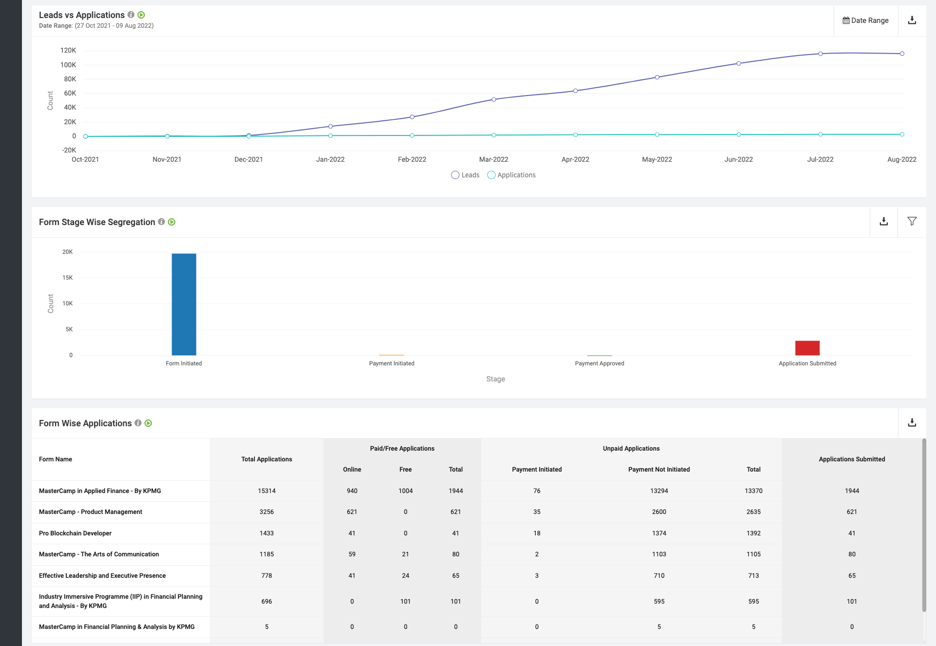
/ 1.1 Project Background
Masters' Union is a tech-first business school that scaled rapidly - but its internal operations couldn't keep pace. Before Dinero, two disconnected systems managed the entire admissions and fee cycle:
Dinero was built to unify this entire journey into one platform - grounded in a single core principle: you don't get to design the solution until you understand the problem.
NPF: captured applications and stored student records.
Pinelab: processed fee payments as an external gateway.
/ The Real 8-Step Manual Journey (Pre-Dinero)
Total overhead: 3–5 hours of non-value-added admin work daily. Every step above = a design opportunity Dinero solved.
/ 1.2 Research Goals
Understand
The end-to-end student journey across all 8 steps from NPF application to enrollment
Identify
The highest-severity pain points across students, admins, and faculty
Define
What a unified platform must do to replace the fragmented NPF + Excel + Pinelab stack
Validate
Design decisions through iterative usability testing before development
Measure
UX quality post-launch using the HEART framework
/ 1.3 Research Questions
Research planning began with 95+ open questions captured during stakeholder kickoffs and admin shadowing. Affinity-mapped into 8 thematic clusters, then distilled to 8 lead questions that drove primary research and testing.
Theme
Lead Research Question
Sub-Qs
Method
Admission Journey
What does the real 8-step admission journey look like and where does it break?
10
Contextual inquiry + stakeholder interviews
Trust & Payment Anxiety
Why do students distrust the Pinelab payment link sent via email?
14
User interviews (laddering)
Admin Efficiency
Where do admins lose the most time across NPF, Excel, and Pinelab?
22
Contextual observation + time-on-task logging
Role-Specific Needs
What information does each role (student, admin, faculty) need and when?
16
Role-based interviews + card sorting
Scholarship & Loan Flows
How do scholarship decisions and loan requests move through people and systems today?
12
Stakeholder interviews + workflow mapping
Cross-System Data Sync
How does student data move (or fail to move) between NPF, Excel, Pinelab, and CRM?
9
Systems audit + admin observation
Task Completion
Can a student complete application → payment → enrollment without admin help, in under 8 minutes?
6
Moderated usability testing (R1 & R2)
Trust Restoration
Does the embedded Pinelab flow reduce abandonment vs. the external email link?
5
A/B testing + post-task interview
/ 1.4 KPIs & Success Metrics
Admin manual effort
0.8 hr/day
−80%
Baseline: 3–5 hrs/day
Target: < 1 hr/day
Payment abandonment
6%
−19 pts
Baseline: ~25%
Target: < 10%
Tool Consolidation
3 →1
−2 platform
Baseline: NPF + Excel + PinelaB
Target: 1 unified
Task success rate
87%
+7 pts vs target
Baseline: 64% (R1)
Target: ≥ 80%
/ 1.6 Participants
5
Students
User interviews · Card sorting · Usability testing (R1 & R2)
3
Admin
Contextual observation · User interviews · Usability testing
3
Faculty
Stakeholder interviews · Workflow validation
/ 1.7 Usability Test Script
"Hi, thank you for joining us. I'm Dhiraj a designer on the Dinero team. We're testing the product today, not you. There are no wrong answers. Please think out loud tell us what you're reading, what you expect, what surprises you. You can stop at any time. Any questions before we begin?"

You've just received your offer letter. Please pay your first semester fee using Dinero.
Scenario 1
Student Payment Flow
Success
Payment completed within 5 minutes · No errors observed
Watch for
Trust hesitation · Confusion on fee breakdown · Missing confirmation states

You just completed your first interview with a candidate. Please update the candidate status to "Shortlisted".
Scenario 2
Admin Candidate Management
Success
Status updated within 30 seconds
Watch for
Navigation path · Search vs. browse behavior · Dead ends
You are a counselor. A student just completed their counseling session with you. Please log your notes and set a follow-up reminder.
Scenario 3
Counselor Follow-up
Success
Note saved · Reminder set within 60 seconds
Watch for
Where they look first · Follow-up cadence selection · Reminder placement
Post-task questions
- How difficult was this task? (1 = very easy to 5 = very hard)
- What was missing that surprised you?
- What did you expect to happen after that action?
- If you could change one thing about that flow, what would it be?
Exit interview questions
- Overall, how does this product compare to the tools you currently use?
- What is the single most important thing this platform does for you?
- What would stop you from using this daily?
/ 1.8 Study Schedule
Oct 2022 – Feb 2023
Week 1–2
Week 3-4
Week 5-6
Week 7-8
Week 9-10
Week 11-12
Week 13–14
Week 15-16
Week 17-18
Stakeholder interviews · Research plan finalisation · Participant recruitment
User interviews Students (5 sessions) · Admin (3 sessions)
User interviews Faculty (3 sessions)
Card sorting
Competitive analysis
Affinity mapping · JTBD framework · Persona development · Journey mapping
Round 1 usability testing 5 participants
Design iteration based on Round 1 findings
Round 2 usability testing Heuristic evaluation
Wireframing · Lo-fi to mid-fi prototype (35 screens)
Hi-fi UI · Design system (30 components) · Figma Dev Mode handoff
/ 2.1 Stakeholder Interviews
Before talking to any end users, we ran alignment sessions with the Product Manager and two Admin Leads. The goal was not to gather requirements it was to understand the business context, the constraints, and how each stakeholder defined success.
60 min

Product Manager
Business goals, success definition, scope constraints
45 min

Admin Lead
Current NPF → CRM workflow, daily pain points, time estimates
45 min
Finance
Payment tracking, reconciliation process, error frequency
Key Tensions Surfaced
- Leadership believed the primary problem was "students not completing payments" research revealed it was a trust design problem, not a student behaviour problem.
- Admins underreported their daily manual effort in initial interviews (said "1–2 hours") contextual observation revealed the real number was 3–5 hours.
- No stakeholder had mapped the full 8-step journey end-to-end before this project it had never been documented in one place.
/ 2.2 Competitive Analysis
Before evaluating the market, we audited what was already in daily use at Masters' Union. These weren't "competitors" — they were the legacy stack Dinero was being built to replace.
Used For
Gap That Drove Dinero
Application intake · student record storage
No workflow operation — admins had to export to Excel for every action
Manual tracking of interview scores · scholarship decisions · payment status
No single source of truth ·
multi-hour daily reconciliation
External fee payment gateway
No Masters' Union branding · 14–15 day manual reconciliation · ~25% abandonment
Optimized For
Gap We Observed
Lead capture and applicant CRM for Indian institutions
Strong on intake; limited on post-admission workflows
Global tuition payments with multi-currency and compliance
Strong on payment infra; not built to own admissions lifecycle
Student information systems and reporting (US/UK focus)
Strong on records; required heavy integration for Indian context
/ 2.3 User Interviews
After stakeholder alignment and market audit, we ran 11 semi-structured user interviews across three role groups — students, admins, and faculty — to understand the lived experience of the existing admissions workflow.
Format
Semi-structured · remote via Google Meet · 45–60 min each
Sample
5 students · 3 admins (+ 2 contextual observation sessions in-office) · 3 faculty
Techniques
Open-ended exploration → laddering on payment trust theme → critical incident technique for admin pain
What We Listened For
- Real workflow vs. described workflow (the 1-2 hr vs. 3-5 hr gap surfaced here)
- Emotional language around payment ("phishing," "fake," "scary") that signaled trust gaps
- Workarounds — what users did when the official tool failed them (spreadsheets, WhatsApp, personal email drafts)
- Information needs that varied by role and time of day
Output
200+ individual observations and quotes captured in transcript form — feeding directly into Affinity Mapping (Section 2.4).
/ 2.4 Affinity Mapping
After 11 interviews and 2 contextual observation sessions, we had ~190 individual data points. Every observation, quote and pain point went onto its own sticky note. Then we grouped bottom-up, no predefined categories. The clusters didn't come from analysis. They emerged from the grouping.
Total: 188 notes clustered across 5 themes
/ Jobs to Be Done
JTBD moves the conversation away from features and toward motivation. Instead of "what do users want?", you ask: what job are they hiring this product to do?
User
When I…
I want to…
So I can…
ADMIN
Start my workday
See every pending action in one view
Stop opening NPF, Pinelab and Excel
ADMIN
Update a student status
Do it in one click with confirmation
Move to the next task immediately
Faculty
Finish a counseling session
Log notes right there in the platform
Not lose context or forget follow-ups
STUDENt
Check my admission status
See it instantly - no emails
Stop anxiously checking my inbox
STUDENt
Pay my semester fee
Complete it inside one trusted platform
Have proof and peace of mind
/ 2.5 User Personas - 3 Research-Backed Roles
These personas were built directly from interview data - not from assumptions. Every goal, pain point and JTBD below was mentioned by at least 2 of the participants in that role group.
Aditya Verma
MBA Student - Age: 22
Aditya is a driven MBA student focused on securing a great job post-graduation, but he finds the admission and financial process confusing. He struggles to track interview progress, fee payments and counselor feedback - often missing important updates. He prefers digital solutions but gets frustrated when he has to check multiple platforms. He wants one place where everything just works.
Goals
→
Track interview progress and feedback in real time - no more waiting for email updates
→
Pay fees quickly without worrying about third-party links or whether payment went through
→
Access counselor reports and meeting history in one place
→
Join clubs and events without long approval processes or scattered notifications
Pain Points
×
Confusing interview process - unclear next steps, no visibility into stage
×
Third-party payment issues - external link felt untrustworthy, no receipt
×
Scattered feedback from counselors - difficult to access reports from previous sessions
HEARS
→
You need to pay your fees via this third-party link.
→
Your interview status will be updated soon.
→
You missed the deadline for your counselor feedback session.
SEES
Multiple emails from admissions with unclear instructions. Screenshots and spreadsheets to track interview progress. Other students discussing the process in WhatsApp groups.
SAYS & DOES
→
Where do I check my interview status?
→
Did my payment go through? How do I get a receipt?
→
Asks peers for updates. Logs into multiple platforms.
THINKS & FEELS
→
I wish there was one place to track everything.
→
Why do I need to use third-party payment links?
→
Am I missing important deadlines?
Priya Sharma
Admissions & Finance Administrator - Age: 42
Priya is responsible for managing student admissions, financial records and interview tracking. She works with multiple tools daily to approve applications, verify transactions and track refund requests. The lack of a centralized system makes her job exhausting - she handles 2-4 data discrepancy errors daily across NPF, Pinelab, Excel and email.
Goals
→
Streamline the admission approval process to reduce manual work
→
Get real-time insights into student finances, transactions and interview status
→
Automate fee processing and refunds to avoid delays and student complaints
→
Ensure data accuracy in reports without switching between multiple platforms
Pain Points
×
Too many manual approvals - time-consuming and error-prone
×
Scattered data across NPF, Pinelab, Excel and email - hard to get a complete student picture
×
Delayed fee verification and refund processing - leading to daily student complaints
×
No single dashboard for managing student interactions across all touchpoints
HEARS
→
We need to approve 50+ applications today
→
How many students have completed fee payments?
→
Students are complaining about missing payment confirmations
SEES
Multiple spreadsheets tracking student fee payments. Unorganized email requests for refund approvals. Confusion about fee statuses across different platforms.
SAYS & DOES
→
I need to check multiple systems to track student applications
→
Tracks counselor interactions separately from financial records. Compiles manual reports each morning.
THINKS & FEELS
→
There must be a better way to manage all of this.
→
I spend 4 hours a day just reconciling data.
→
Why can't I see a student's full journey in one place?
Dr. Rajeev Menon
Faculty & Student Counselor- Age: 40
Dr. Rajeev Menon has been mentoring students for over a decade, helping them navigate academic and career paths. Without a structured system, his feedback gets lost in emails. He struggles to track student engagement across counseling sessions and has no way to flag at-risk students early.
Goals
→
Provide timely and structured feedback to students after interviews and sessions
→
Have a centralized system to track student history, progress and counselor interactions
→
Improve student engagement in career mentorship and academic guidance
→
Reduce the need for manual note-keeping and fragmented communication
Pain Points
×
No centralized student tracking system - feedback often gets lost in email drafts
×
Manual documentation is inefficient and takes too much time between sessions
×
Hard to ensure students are following up on counseling sessions and interview feedback
HEARS
→
Can you check in on this student? I think they're struggling
→
Your session notes weren't attached to the student record
→
A student from last month missed their follow-up.
SEES
No structured view of students he has counseled. Emails as the only record system. Students re-explaining context he should already know.
SAYS & DOES
→
My session notes live in my professional email drafts.
→
I have to reconstruct context from memory each time
→
Manually tracks follow-ups in a personal notebook.
THINKS & FEELS
→
I'm losing context between sessions - I can't be an effective mentor this way.
→
I want to flag at-risk students but there's no channel
→
This should all be in one place.
/ 2.6 User journey
With personas defined, we mapped each user's end-to-end journey through the existing admissions workflow — capturing actions, touchpoints, emotional state, and opportunities at each stage.
1 · Intake
2 · Scheduling
3 · Interview
4 · Decision
5 · Offer
6 · Payment
7 · Enrollment
Student
Submit application
via website
Complete?
Incomplete-docs email
Wait for slot
Slot invite received
email + Calendar
Attend interview
video / in-person
No-show
Admissions decision
Full 100%
Partial 25–75%
No scholarship
Rejected
Reschedule
Receive offer letter
Branded · MU
Accept?
Decline / lapse 7d
Payment path
Pinelab (full)
Loan / EMI
Deposit 1/3·1/6·1/12
Payment failed (x3)
Abandoned >24h
Enrolled — Dashboard
Admin
Upload CSV from NPF
batch · weekly
CSV validation error
Schedule + send invites
bulk · 1-click
Track interview status
live dashboard
Faculty no-show — reassign
Decision Board
panel + admin
Tie-break: founder
Auto-trigger offer letter
branded · 1-click
Track payments
real-time
Auto-sync
NPF + CRM + Excel
Sync conflict — manual merge
Faculty
Score candidate
Score overdue >48h
Student
Admin
Faculty
Decision ◇
Success end
Edge case
Critical edge
5 critical handoff moments — where student & admin lanes interact
H1 · Application
Admin CSV → Student Portal
⚠ Duplicate / invalid row
H2 · Slot Invite
Scheduler → Student inbox
⚠ Wrong tz / bounce
H3 · Decision
Faculty + Admin → Student
⚠ Same-day SLA miss
H4 · Offer Letter
Admin → Student (Pinelab)
⚠ Un-branded (legacy)
H5 · Payment confirm
Pinelab → CRM/NPF/Excel
⚠ Sync race condition
/ 2.7 User Flow
Information architecture for Dinero emerged through participant-led grouping during user interviews and the affinity mapping process (Section 2.4). Rather than running formal card sorting with end users, IA categories surfaced organically — and were then validated in an internal design-team workshop before wireframing.
/ 2.8 Information architecture
Information architecture for Dinero emerged through participant-led grouping during user interviews and the affinity mapping process (Section 2.4). Rather than running formal card sorting with end users, IA categories surfaced organically — and were then validated in an internal design-team workshop before wireframing.
Step 1
Applied Finance Cohort View
Sketch intent
admin dashboard with cohort rows, expandable program categories, and a single CTA to create program
What changed in hi-fi
added cohort summary actions, refresh cashflow control, and clear program/cohort hierarchy in the navigation
Result: single-screen view replaced cross-tab NPF + Excel reconciliation

/ 2.9 Usability Testing
Usability testing ran in two rounds, four weeks apart. Round 1 tested the mid-fi prototype against the three scenarios from Section 1.7. Round 2 tested the hi-fi build after iteration. The goal wasn't to confirm we'd built it right — it was to find what was broken while fixes were still cheap.
Metric
Round 1 (Mid-fi)
Round 2 (Hi-fi)
Fidelity
Mid-fi Figma prototype
Hi-fi production-spec build
Participants
5 (3 students · 1 admin · 1 faculty)
--
Task success rate
64%
87%
Critical issues surfaced
7
--
Method
- Moderated remote sessions via Google Meet · screen-share with think-aloud protocol
- Three scenarios per participant (Student payment · Admin candidate management · Counselor follow-up)
- Success criteria pre-defined per scenario (time + error count)
- Post-task SEQ rating · Exit interview at end of session
- Recordings transcribed and tagged by theme · findings clustered by severity
/ 2.10 Data Collected
The full data corpus produced during the research and design phase of Dinero. Every artifact below is traceable to a section in this case study.
Section
Artifact
Count / Detail
2.1
Stakeholder interview transcripts
3 sessions · 2.5 hours total
2.3
User interview transcripts
11 sessions · ~10 hours total
2.3
Contextual observation notes
2 in-office sessions
2.4
Raw research observations
~190 individual data points
2.4
Affinity clusters
5 themes · 188 notes mapped
2.5
User personas (research-backed)
3 personas · 1 per role group
2.6
Journey maps
3 visuals (current · future · swimlane)
2.7
IA categories
5 top-level · validated cross-role
2.8
Wireframe sketches
9 notebook + 3 whiteboard sessions
2.8
Production screens (Figma)
35 screens · mid-fi to hi-fi
2.8
Design system components
30 components · token-based
2.9
Usability test recordings
Round 1 + Round 2 · transcribed + tagged
/ 3.1 Identify Patterns
Pattern recognition in this project worked at two levels. First — within each role: what did students consistently say? What did admins consistently do? Second — across roles: what showed up in 2 or more groups despite different vocabularies?
Fragmentation Fatigue
Admin role · 48 notes · multi-tab workflow described as exhausting
Visibility Anxiety
Student role · 41 notes · inbox-checking and peer-comparison behavior
Admin Info Overload
Admin role · 41 notes · firefighting before real work
Counselor Invisibility
Faculty role · 32 notes · session notes lost in email drafts
Payment Trust Deficit
Student role · 26 notes · "phishing" language unprompted
Cross-role signals
Workaround behavior every role described using non-sanctioned tools (personal spreadsheets, WhatsApp, email drafts) when the official system failed them. The workaround was the unmet need.

Information needs varied by time of day admins needed cohort view in the morning, individual student view in the afternoon. Students needed status visibility immediately after major touchpoints.
Trust as design students and admins both described moments of "is this real?" Trust signals (branding, confirmation, receipts) mattered as much as functional design.

/ 4.1 Sprint Planning
Research surfaces problems. Sprints translate those problems into shippable design decisions. The hardest discipline in this phase wasn't generating ideas — it was protecting research priorities from feature creep when stakeholders asked for "just one more thing."
/ 4.2 Final UI
The final UI is the most visible artifact of this case study — but it is the least important one until everything before it has been understood. The screens shipped because the research justified them, the wireframing tested them, and the design system made them coherent.
/ 4.3 Impact
Five months of research and design produced four measurable changes in how Masters' Union runs admissions. Each metric ties to a specific design decision documented earlier.
TASK SUCCESS RATE
87%
+23 pts
Baseline: 64% · R2 result: 87%
PAYMENT COMPLETION
93%
+19 pts
Baseline: ~74% (1 − 25% abandonment)
PAYMENT ABANDONMENT
6%
−19 pts
Baseline: ~25% · Target: <10%
Target: < 1 hr/day
ADMIN MANUAL EFFORT
<1 hr/day
−80%
Baseline: 3–5 hrs/day
/ 4.4 Core Learnings
After organising data by role, cross-role synthesis revealed 5 patterns that cut across all three user groups. Each appeared in at least 2 of 3 roles.
01
Stakeholders misattribute problems research locates them
Leadership came in believing the problem was students not completing payments. Research revealed it was a trust design failure: students were willing to pay, but the experience made them feel unsafe. The fix wasn't a reminder email it was embedding the gateway. This project taught me to hold the question open longer before accepting a stakeholder's problem definition.
02
Observation reveals what interviews cannot
Admins told us in interviews they spent 1-2 hours on daily overhead. Contextual observation showed the real number was 3-5 hours. They weren't lying - they had normalized the effort and lost calibration on how long tasks actually took. Self-report and observation are different data sources. Both are necessary. This project made me default to observation-first for workflow-heavy user groups.
03
Card sorting isn't just an IA exercise - it's a conflict resolution tool
When I proposed role-based dashboards in early stakeholder reviews, the PM pushed back: Can't we just have one view with filters? The card sorting data ended that conversation. Participants didn't group the same cards the same way - the data made the case I couldn't make from intuition alone. Using research as a decision-making tool, not just a discovery tool, is the shift this project crystallized.
04
Test early enough to fail cheaply
Round 1 testing at mid-fi found 7 critical issues before a single line of code was written. The cost to fix those in Figma was hours. The cost to fix them post-development would have been weeks. The 63% -> 87% improvement wasn't just a UX win - it was a product risk mitigation. This is the argument I now use internally when engineering timelines push back against early testing.
05
The design system is a research artifact, not just a component library
The 30-component token-based system wasn't built for aesthetic consistency - it was built because 3 role-based dashboards serving different mental models still needed to feel like one product. Every token decision (colour, spacing, type) was constrained by the requirement that all 3 roles could trust the same visual language while having completely different information architectures. The system encoded the research.
Author
Dhiraj Chouhan
Framework
Double Diamond
HEART Framework
GSM Model
Study Type
Mixed Methods: Generative + Evaluative Research
Timeline
2021 – 2023
Reformatted 2025
Tools Used
Team
1 PM · 3 UX/UI Designers · 8 Engineers · 2 QA
I live for flow-that sweet spot where creativity meets clarity.
View Resume
@imdhirajchouhan
Back to Top
नमस्कार
I’m Dhiraj Chouhan
I’m Dhiraj Chouhan
Download Resume
The research process documented in this case study - the user interviews, card sorting, contextual observation, affinity mapping, usability testing and A/B testing - was conducted as described. Dinero was a real, 2-year product built and shipped at Masters' Union. Some specific data values, feedback quotes and metrics shown have been modified or made representative to protect participant privacy and institutional data confidentiality. The insights, findings and design decisions accurately reflect what was discovered during the research.
Back to Home Page
Dinero
Internal Platform
for Masters' Union
UX Research Case Study
From an 8-step manual admissions journey to a unified platform - serving 1,000+ students, eliminating 3–5 hours of daily admin overhead and converting an external payment link into 93% in-app completion.
USER RESEARCH
Product Design
Double Diamond
EdTech
1,000+
Students Onboarded
87%
Usability Task Success
93%
Payment Completion (A/B)
<1 hr
Admin Daily Overhead
Research Plan
Research Execution
Analysis & Synthesis
Outcomes
/ 1.1 Project Background
Masters' Union is a tech-first business school that scaled rapidly - but its internal operations couldn't keep pace. Before Dinero, two disconnected systems managed the entire admissions and fee cycle:
Dinero was built to unify this entire journey into one platform - grounded in a single core principle: you don't get to design the solution until you understand the problem.
NPF: captured applications and stored student records.
Pinelab: processed fee payments as an external gateway.
/ The Real 8-Step Manual Journey (Pre-Dinero)
Total overhead: 3–5 hours of non-value-added admin work daily. Every step above = a design opportunity Dinero solved.
/ 1.2 Research Goals
Understand
The end-to-end student journey across all 8 steps from NPF application to enrollment
Identify
The highest-severity pain points across students, admins, and faculty
Define
What a unified platform must do to replace the fragmented NPF + Excel + Pinelab stack
Validate
Design decisions through iterative usability testing before development
Measure
UX quality post-launch using the HEART framework
/ 1.3 Research Questions
Research planning began with 95+ open questions captured during stakeholder kickoffs and admin shadowing. Affinity-mapped into 8 thematic clusters, then distilled to 8 lead questions that drove primary research and testing.
Theme
Lead Research Question
Sub-Qs
Method
Admission Journey
What does the real 8-step admission journey look like and where does it break?
10
Contextual inquiry + stakeholder interviews
Trust & Payment Anxiety
Why do students distrust the Pinelab payment link sent via email?
14
User interviews (laddering)
Admin Efficiency
Where do admins lose the most time across NPF, Excel, and Pinelab?
22
Contextual observation + time-on-task logging
Role-Specific Needs
What information does each role (student, admin, faculty) need and when?
16
Role-based interviews + card sorting
Scholarship & Loan Flows
How do scholarship decisions and loan requests move through people and systems today?
12
Stakeholder interviews + workflow mapping
Cross-System Data Sync
How does student data move (or fail to move) between NPF, Excel, Pinelab, and CRM?
9
Systems audit + admin observation
Task Completion
Can a student complete application → payment → enrollment without admin help, in under 8 minutes?
6
Moderated usability testing (R1 & R2)
Trust Restoration
Does the embedded Pinelab flow reduce abandonment vs. the external email link?
5
A/B testing + post-task interview
/ 1.4 KPIs & Success Metrics
Admin manual effort
0.8 hr/day
−80%
Baseline: 3–5 hrs/day
Target: < 1 hr/day
Payment abandonment
6%
−19 pts
Baseline: ~25%
Target: < 10%
Tool Consolidation
3 →1
−2 platform
Baseline: NPF + Excel + PinelaB
Target: 1 unified
Task success rate
87%
+7 pts vs target
Baseline: 64% (R1)
Target: ≥ 80%
/ 1.6 Participants
5
Students
User interviews · Card sorting · Usability testing (R1 & R2)
3
Admin
Contextual observation · User interviews · Usability testing
3
Faculty
Stakeholder interviews · Workflow validation
/ 1.7 Usability Test Script
"Hi, thank you for joining us. I'm Dhiraj a designer on the Dinero team. We're testing the product today, not you. There are no wrong answers. Please think out loud tell us what you're reading, what you expect, what surprises you. You can stop at any time. Any questions before we begin?"
You've just received your offer letter. Please pay your first semester fee using Dinero.
Scenario 1
Student Payment Flow
Success
Payment completed within 5 minutes · No errors observed
Watch for
Trust hesitation · Confusion on fee breakdown · Missing confirmation states
You just completed your first interview with a candidate. Please update the candidate status to "Shortlisted".
Scenario 2
Admin Candidate Management
Success
Status updated within 30 seconds
Watch for
Navigation path · Search vs. browse behavior · Dead ends
You are a counselor. A student just completed their counseling session with you. Please log your notes and set a follow-up reminder.
Scenario 3
Counselor Follow-up
Success
Note saved · Reminder set within 60 seconds
Watch for
Where they look first · Follow-up cadence selection · Reminder placement
Post-task questions
- How difficult was this task? (1 = very easy to 5 = very hard)
- What was missing that surprised you?
- What did you expect to happen after that action?
- If you could change one thing about that flow, what would it be?
Exit interview questions
- Overall, how does this product compare to the tools you currently use?
- What is the single most important thing this platform does for you?
- What would stop you from using this daily?
/ 1.8 Study Schedule
Oct 2022 – Feb 2023
Week 1–2
Week 3-4
Week 5-6
Week 7-8
Week 9-10
Week 11-12
Week 13–14
Week 15-16
Week 17-18
Stakeholder interviews · Research plan finalisation · Participant recruitment
User interviews Students (5 sessions) · Admin (3 sessions)
User interviews Faculty (3 sessions)
Card sorting
Competitive analysis
Affinity mapping · JTBD framework · Persona development · Journey mapping
Round 1 usability testing 5 participants
Design iteration based on Round 1 findings
Round 2 usability testing Heuristic evaluation
Wireframing · Lo-fi to mid-fi prototype (35 screens)
Hi-fi UI · Design system (30 components) · Figma Dev Mode handoff
/ 2.1 Stakeholder Interviews
Before talking to any end users, we ran alignment sessions with the Product Manager and two Admin Leads. The goal was not to gather requirements it was to understand the business context, the constraints, and how each stakeholder defined success.
60 min
Product Manager
Business goals, success definition, scope constraints
45 min

Admin Lead
Current NPF → CRM workflow, daily pain points, time estimates
45 min
Finance
Payment tracking, reconciliation process, error frequency
Key Tensions Surfaced
- Leadership believed the primary problem was "students not completing payments" research revealed it was a trust design problem, not a student behaviour problem.
- Admins underreported their daily manual effort in initial interviews (said "1–2 hours") contextual observation revealed the real number was 3–5 hours.
- No stakeholder had mapped the full 8-step journey end-to-end before this project it had never been documented in one place.
/ 2.2 Competitive Analysis
Before evaluating the market, we audited what was already in daily use at Masters' Union. These weren't "competitors" — they were the legacy stack Dinero was being built to replace.
Used For
Gap That Drove Dinero
Application intake · student record storage
No workflow operation — admins had to export to Excel for every action
Manual tracking of interview scores · scholarship decisions · payment status
No single source of truth ·
multi-hour daily reconciliation
External fee payment gateway
No Masters' Union branding · 14–15 day manual reconciliation · ~25% abandonment
Optimized For
Gap We Observed
Lead capture and applicant CRM for Indian institutions
Strong on intake; limited on post-admission workflows
Global tuition payments with multi-currency and compliance
Strong on payment infra; not built to own admissions lifecycle
Student information systems and reporting (US/UK focus)
Strong on records; required heavy integration for Indian context
/ 2.3 User Interviews
After stakeholder alignment and market audit, we ran 11 semi-structured user interviews across three role groups — students, admins, and faculty — to understand the lived experience of the existing admissions workflow.
Format
Semi-structured · remote via Google Meet · 45–60 min each
Sample
5 students · 3 admins (+ 2 contextual observation sessions in-office) · 3 faculty
Techniques
Open-ended exploration → laddering on payment trust theme → critical incident technique for admin pain
What We Listened For
- Real workflow vs. described workflow (the 1-2 hr vs. 3-5 hr gap surfaced here)
- Emotional language around payment ("phishing," "fake," "scary") that signaled trust gaps
- Workarounds — what users did when the official tool failed them (spreadsheets, WhatsApp, personal email drafts)
- Information needs that varied by role and time of day
Output
200+ individual observations and quotes captured in transcript form — feeding directly into Affinity Mapping (Section 2.4).
/ 2.4 Affinity Mapping
After 11 interviews and 2 contextual observation sessions, we had ~190 individual data points. Every observation, quote and pain point went onto its own sticky note. Then we grouped bottom-up, no predefined categories. The clusters didn't come from analysis. They emerged from the grouping.
Total: 188 notes clustered across 5 themes
/ Jobs to Be Done
JTBD moves the conversation away from features and toward motivation. Instead of "what do users want?", you ask: what job are they hiring this product to do?
User
When I…
I want to…
So I can…
ADMIN
Start my workday
See every pending action in one view
Stop opening NPF, Pinelab and Excel
ADMIN
Update a student status
Do it in one click with confirmation
Move to the next task immediately
Faculty
Finish a counseling session
Log notes right there in the platform
Not lose context or forget follow-ups
STUDENt
Check my admission status
See it instantly - no emails
Stop anxiously checking my inbox
STUDENt
Pay my semester fee
Complete it inside one trusted platform
Have proof and peace of mind
/ 2.5 User Personas - 3 Research-Backed Roles
These personas were built directly from interview data - not from assumptions. Every goal, pain point and JTBD below was mentioned by at least 2 of the participants in that role group.
Aditya Verma
MBA Student - Age: 22
Aditya is a driven MBA student focused on securing a great job post-graduation, but he finds the admission and financial process confusing. He struggles to track interview progress, fee payments and counselor feedback - often missing important updates. He prefers digital solutions but gets frustrated when he has to check multiple platforms. He wants one place where everything just works.
Goals
→
Track interview progress and feedback in real time - no more waiting for email updates
→
Pay fees quickly without worrying about third-party links or whether payment went through
→
Access counselor reports and meeting history in one place
→
Join clubs and events without long approval processes or scattered notifications
Pain Points
×
Confusing interview process - unclear next steps, no visibility into stage
×
Third-party payment issues - external link felt untrustworthy, no receipt
×
Scattered feedback from counselors - difficult to access reports from previous sessions
HEARS
→
You need to pay your fees via this third-party link.
→
Your interview status will be updated soon.
→
You missed the deadline for your counselor feedback session.
SEES
Multiple emails from admissions with unclear instructions. Screenshots and spreadsheets to track interview progress. Other students discussing the process in WhatsApp groups.
SAYS & DOES
→
Where do I check my interview status?
→
Did my payment go through? How do I get a receipt?
→
Asks peers for updates. Logs into multiple platforms.
THINKS & FEELS
→
I wish there was one place to track everything.
→
Why do I need to use third-party payment links?
→
Am I missing important deadlines?
Priya Sharma
Admissions & Finance Administrator - Age: 42
Priya is responsible for managing student admissions, financial records and interview tracking. She works with multiple tools daily to approve applications, verify transactions and track refund requests. The lack of a centralized system makes her job exhausting - she handles 2-4 data discrepancy errors daily across NPF, Pinelab, Excel and email.
Goals
→
Streamline the admission approval process to reduce manual work
→
Get real-time insights into student finances, transactions and interview status
→
Automate fee processing and refunds to avoid delays and student complaints
→
Ensure data accuracy in reports without switching between multiple platforms
Pain Points
×
Too many manual approvals - time-consuming and error-prone
×
Scattered data across NPF, Pinelab, Excel and email - hard to get a complete student picture
×
Delayed fee verification and refund processing - leading to daily student complaints
×
No single dashboard for managing student interactions across all touchpoints
HEARS
→
We need to approve 50+ applications today
→
How many students have completed fee payments?
→
Students are complaining about missing payment confirmations
SEES
Multiple spreadsheets tracking student fee payments. Unorganized email requests for refund approvals. Confusion about fee statuses across different platforms.
SAYS & DOES
→
I need to check multiple systems to track student applications
→
Tracks counselor interactions separately from financial records. Compiles manual reports each morning.
THINKS & FEELS
→
There must be a better way to manage all of this.
→
I spend 4 hours a day just reconciling data.
→
Why can't I see a student's full journey in one place?
Dr. Rajeev Menon
Faculty & Student Counselor- Age: 40
Dr. Rajeev Menon has been mentoring students for over a decade, helping them navigate academic and career paths. Without a structured system, his feedback gets lost in emails. He struggles to track student engagement across counseling sessions and has no way to flag at-risk students early.
Goals
→
Provide timely and structured feedback to students after interviews and sessions
→
Have a centralized system to track student history, progress and counselor interactions
→
Improve student engagement in career mentorship and academic guidance
→
Reduce the need for manual note-keeping and fragmented communication
Pain Points
×
No centralized student tracking system - feedback often gets lost in email drafts
×
Manual documentation is inefficient and takes too much time between sessions
×
Hard to ensure students are following up on counseling sessions and interview feedback
HEARS
→
Can you check in on this student? I think they're struggling
→
Your session notes weren't attached to the student record
→
A student from last month missed their follow-up.
SEES
No structured view of students he has counseled. Emails as the only record system. Students re-explaining context he should already know.
SAYS & DOES
→
My session notes live in my professional email drafts.
→
I have to reconstruct context from memory each time
→
Manually tracks follow-ups in a personal notebook.
THINKS & FEELS
→
I'm losing context between sessions - I can't be an effective mentor this way.
→
I want to flag at-risk students but there's no channel
→
This should all be in one place.
/ 2.6 User journey
With personas defined, we mapped each user's end-to-end journey through the existing admissions workflow — capturing actions, touchpoints, emotional state, and opportunities at each stage.
1 · Intake
2 · Scheduling
3 · Interview
4 · Decision
5 · Offer
6 · Payment
7 · Enrollment
Student
Submit application
via website
Complete?
Incomplete-docs email
Wait for slot
Slot invite received
email + Calendar
Attend interview
video / in-person
No-show
Admissions decision
Full 100%
Partial 25–75%
No scholarship
Rejected
Reschedule
Receive offer letter
Branded · MU
Accept?
Decline / lapse 7d
Payment path
Pinelab (full)
Loan / EMI
Deposit 1/3·1/6·1/12
Payment failed (x3)
Abandoned >24h
Enrolled — Dashboard
Admin
Upload CSV from NPF
batch · weekly
CSV validation error
Schedule + send invites
bulk · 1-click
Track interview status
live dashboard
Faculty no-show — reassign
Decision Board
panel + admin
Tie-break: founder
Auto-trigger offer letter
branded · 1-click
Track payments
real-time
Auto-sync
NPF + CRM + Excel
Sync conflict — manual merge
Faculty
Score candidate
Score overdue >48h
Student
Admin
Faculty
Decision ◇
Success end
Edge case
Critical edge
5 critical handoff moments — where student & admin lanes interact
H1 · Application
Admin CSV → Student Portal
⚠ Duplicate / invalid row
H2 · Slot Invite
Scheduler → Student inbox
⚠ Wrong tz / bounce
H3 · Decision
Faculty + Admin → Student
⚠ Same-day SLA miss
H4 · Offer Letter
Admin → Student (Pinelab)
⚠ Un-branded (legacy)
H5 · Payment confirm
Pinelab → CRM/NPF/Excel
⚠ Sync race condition
/ 2.7 User Flow
Information architecture for Dinero emerged through participant-led grouping during user interviews and the affinity mapping process (Section 2.4). Rather than running formal card sorting with end users, IA categories surfaced organically — and were then validated in an internal design-team workshop before wireframing.
/ 2.8 Information architecture
Information architecture for Dinero emerged through participant-led grouping during user interviews and the affinity mapping process (Section 2.4). Rather than running formal card sorting with end users, IA categories surfaced organically — and were then validated in an internal design-team workshop before wireframing.
Step 1
Applied Finance Cohort View
Sketch intent
admin dashboard with cohort rows, expandable program categories, and a single CTA to create program
What changed in hi-fi
added cohort summary actions, refresh cashflow control, and clear program/cohort hierarchy in the navigation
Result: single-screen view replaced cross-tab NPF + Excel reconciliation
/ 2.9 Usability Testing
Usability testing ran in two rounds, four weeks apart. Round 1 tested the mid-fi prototype against the three scenarios from Section 1.7. Round 2 tested the hi-fi build after iteration. The goal wasn't to confirm we'd built it right — it was to find what was broken while fixes were still cheap.
Metric
Round 1 (Mid-fi)
Round 2 (Hi-fi)
Fidelity
Mid-fi Figma prototype
Hi-fi production-spec build
Participants
5 (3 students · 1 admin · 1 faculty)
--
Task success rate
64%
87%
Critical issues surfaced
7
--
Method
- Moderated remote sessions via Google Meet · screen-share with think-aloud protocol
- Three scenarios per participant (Student payment · Admin candidate management · Counselor follow-up)
- Success criteria pre-defined per scenario (time + error count)
- Post-task SEQ rating · Exit interview at end of session
- Recordings transcribed and tagged by theme · findings clustered by severity
/ 2.10 Data Collected
The full data corpus produced during the research and design phase of Dinero. Every artifact below is traceable to a section in this case study.
Section
Artifact
Count / Detail
2.1
Stakeholder interview transcripts
3 sessions · 2.5 hours total
2.3
User interview transcripts
11 sessions · ~10 hours total
2.3
Contextual observation notes
2 in-office sessions
2.4
Raw research observations
~190 individual data points
2.4
Affinity clusters
5 themes · 188 notes mapped
2.5
User personas (research-backed)
3 personas · 1 per role group
2.6
Journey maps
3 visuals (current · future · swimlane)
2.7
IA categories
5 top-level · validated cross-role
2.8
Wireframe sketches
9 notebook + 3 whiteboard sessions
2.8
Production screens (Figma)
35 screens · mid-fi to hi-fi
2.8
Design system components
30 components · token-based
2.9
Usability test recordings
Round 1 + Round 2 · transcribed + tagged
/ 3.1 Identify Patterns
Pattern recognition in this project worked at two levels. First — within each role: what did students consistently say? What did admins consistently do? Second — across roles: what showed up in 2 or more groups despite different vocabularies?
Fragmentation Fatigue
Admin role · 48 notes · multi-tab workflow described as exhausting
Visibility Anxiety
Student role · 41 notes · inbox-checking and peer-comparison behavior
Admin Info Overload
Admin role · 41 notes · firefighting before real work
Counselor Invisibility
Faculty role · 32 notes · session notes lost in email drafts
Payment Trust Deficit
Student role · 26 notes · "phishing" language unprompted
Cross-role signals
Workaround behavior every role described using non-sanctioned tools (personal spreadsheets, WhatsApp, email drafts) when the official system failed them. The workaround was the unmet need.
Information needs varied by time of day admins needed cohort view in the morning, individual student view in the afternoon. Students needed status visibility immediately after major touchpoints.
Trust as design students and admins both described moments of "is this real?" Trust signals (branding, confirmation, receipts) mattered as much as functional design.
/ 4.1 Sprint Planning
Research surfaces problems. Sprints translate those problems into shippable design decisions. The hardest discipline in this phase wasn't generating ideas — it was protecting research priorities from feature creep when stakeholders asked for "just one more thing."
/ 4.2 Final UI
The final UI is the most visible artifact of this case study — but it is the least important one until everything before it has been understood. The screens shipped because the research justified them, the wireframing tested them, and the design system made them coherent.
/ 4.3 Impact
Five months of research and design produced four measurable changes in how Masters' Union runs admissions. Each metric ties to a specific design decision documented earlier.
TASK SUCCESS RATE
87%
+23 pts
Baseline: 64% · R2 result: 87%
PAYMENT COMPLETION
93%
+19 pts
Baseline: ~74% (1 − 25% abandonment)
PAYMENT ABANDONMENT
6%
−19 pts
Baseline: ~25% · Target: <10%
Target: < 1 hr/day
ADMIN MANUAL EFFORT
<1 hr/day
−80%
Baseline: 3–5 hrs/day
/ 4.4 Core Learnings
After organising data by role, cross-role synthesis revealed 5 patterns that cut across all three user groups. Each appeared in at least 2 of 3 roles.
01
Stakeholders misattribute problems research locates them
Leadership came in believing the problem was students not completing payments. Research revealed it was a trust design failure: students were willing to pay, but the experience made them feel unsafe. The fix wasn't a reminder email it was embedding the gateway. This project taught me to hold the question open longer before accepting a stakeholder's problem definition.
02
Observation reveals what interviews cannot
Admins told us in interviews they spent 1-2 hours on daily overhead. Contextual observation showed the real number was 3-5 hours. They weren't lying - they had normalized the effort and lost calibration on how long tasks actually took. Self-report and observation are different data sources. Both are necessary. This project made me default to observation-first for workflow-heavy user groups.
03
Card sorting isn't just an IA exercise - it's a conflict resolution tool
When I proposed role-based dashboards in early stakeholder reviews, the PM pushed back: Can't we just have one view with filters? The card sorting data ended that conversation. Participants didn't group the same cards the same way - the data made the case I couldn't make from intuition alone. Using research as a decision-making tool, not just a discovery tool, is the shift this project crystallized.
04
Test early enough to fail cheaply
Round 1 testing at mid-fi found 7 critical issues before a single line of code was written. The cost to fix those in Figma was hours. The cost to fix them post-development would have been weeks. The 63% -> 87% improvement wasn't just a UX win - it was a product risk mitigation. This is the argument I now use internally when engineering timelines push back against early testing.
05
The design system is a research artifact, not just a component library
The 30-component token-based system wasn't built for aesthetic consistency - it was built because 3 role-based dashboards serving different mental models still needed to feel like one product. Every token decision (colour, spacing, type) was constrained by the requirement that all 3 roles could trust the same visual language while having completely different information architectures. The system encoded the research.
Author
Dhiraj Chouhan
Framework
Double Diamond
HEART Framework
GSM Model
Study Type
Mixed Methods: Generative + Evaluative Research
Timeline
2021 – 2023
Reformatted 2025
Tools Used
Team
1 PM · 3 UX/UI Designers · 8 Engineers · 2 QA
I live for flow-that sweet spot where creativity meets clarity.
View Resume
@imdhirajchouhan
Back to Top